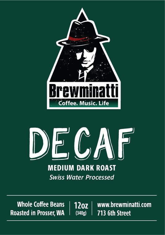
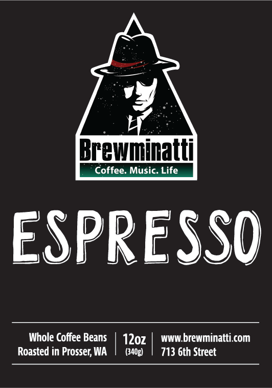
When the local coffeeshop expanded into roasting their own beans, they needed a bag label designed that complimented their existing branding and brought attention to their newest product. The system in particular needed to be versatile enough to accommodate a range of products and highlight the attributes of the different coffee sources and roast types.
Hierarchy was very important to the design, with a decision to place emphasis on the point of origin and roast type using handcrafted type and color. The desire was for a funky, slightly imperfect type and we experimented with several versions to see what worked best as a contrast to the existing clean and modern brand.

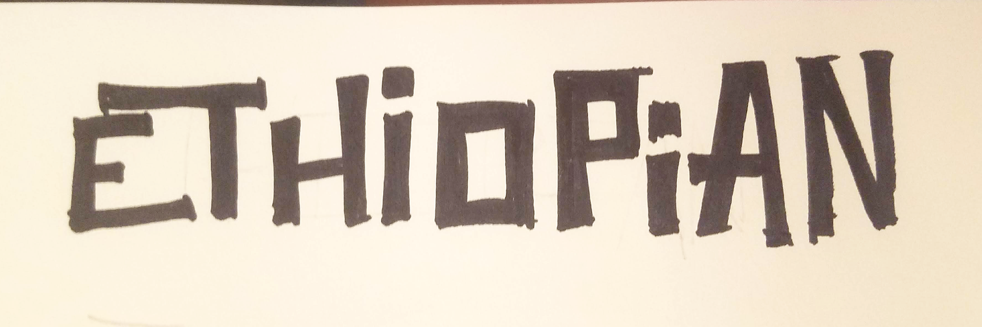
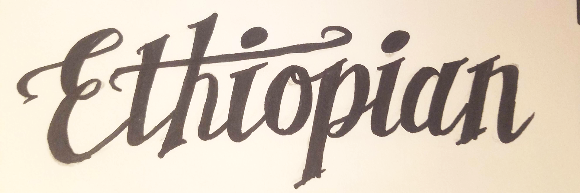
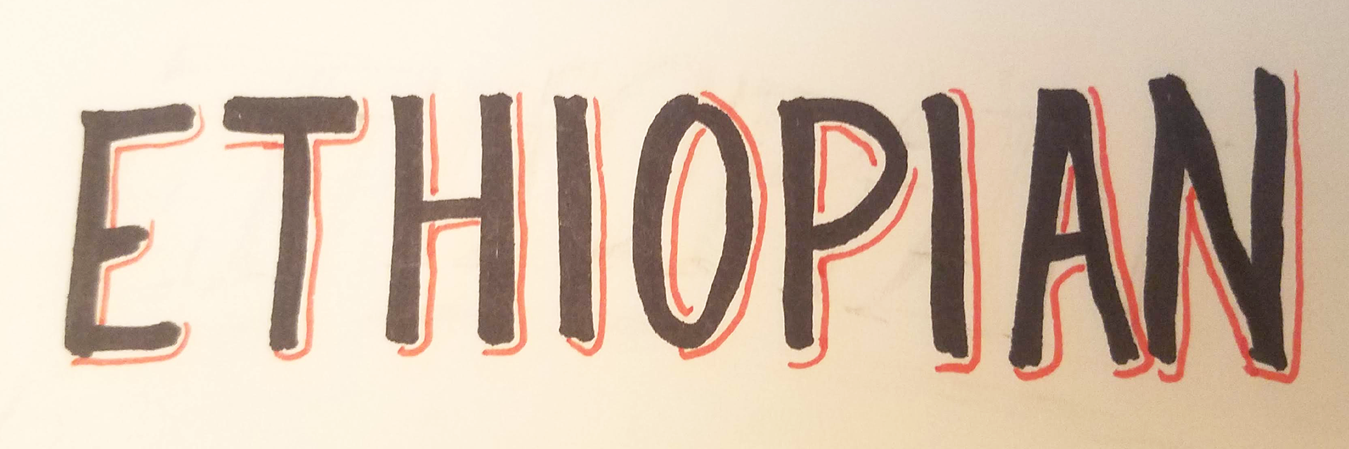
The selected hand drawn type style was scanned and digitized, then applied in white to 3 different background colors that were chosen to complement the existing colors of the logo. We used the red from the logo for the most popular Medium Dark Roast, a lighter orange for the Medium Roast, and a deep purple for the French Roast.
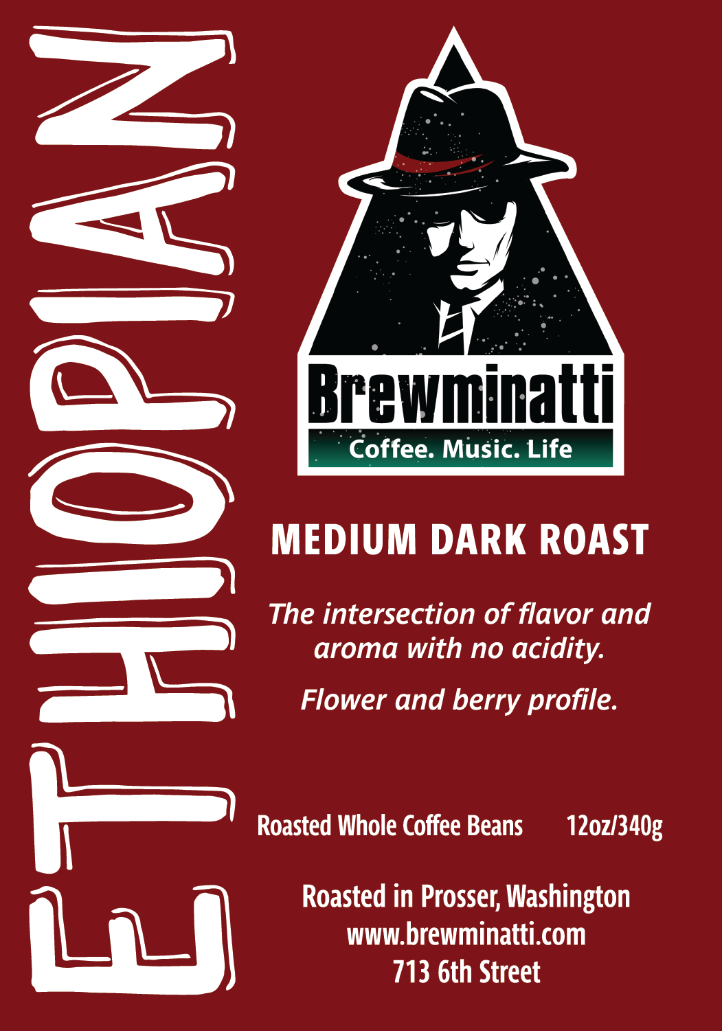
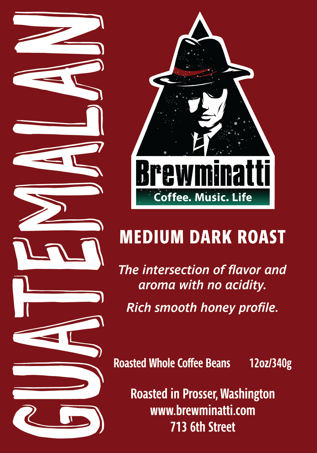
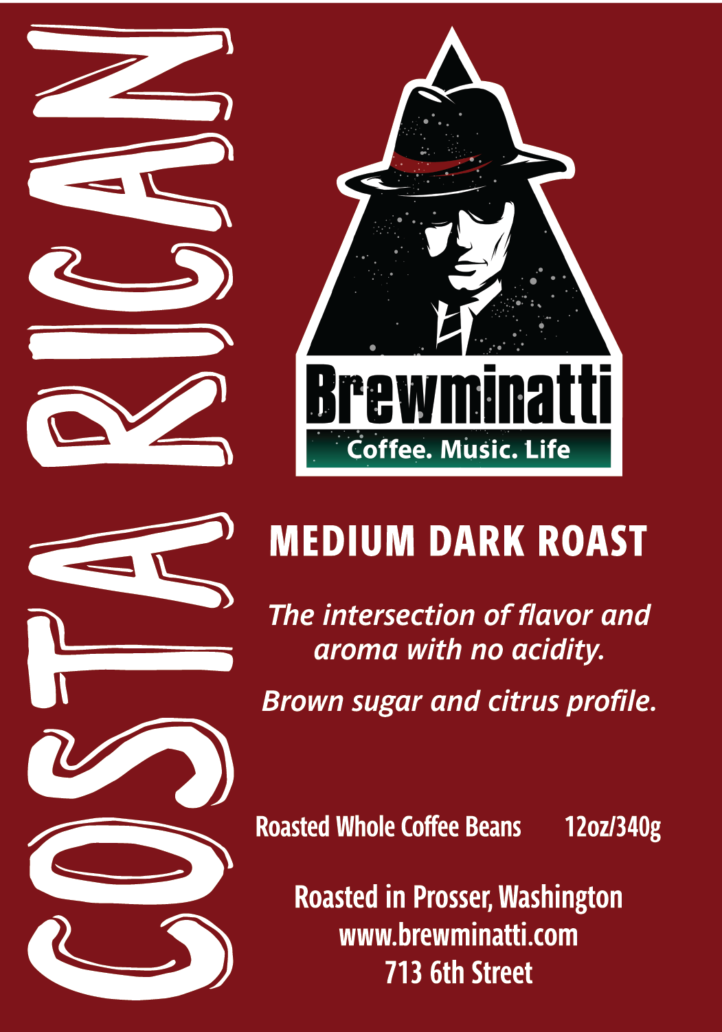
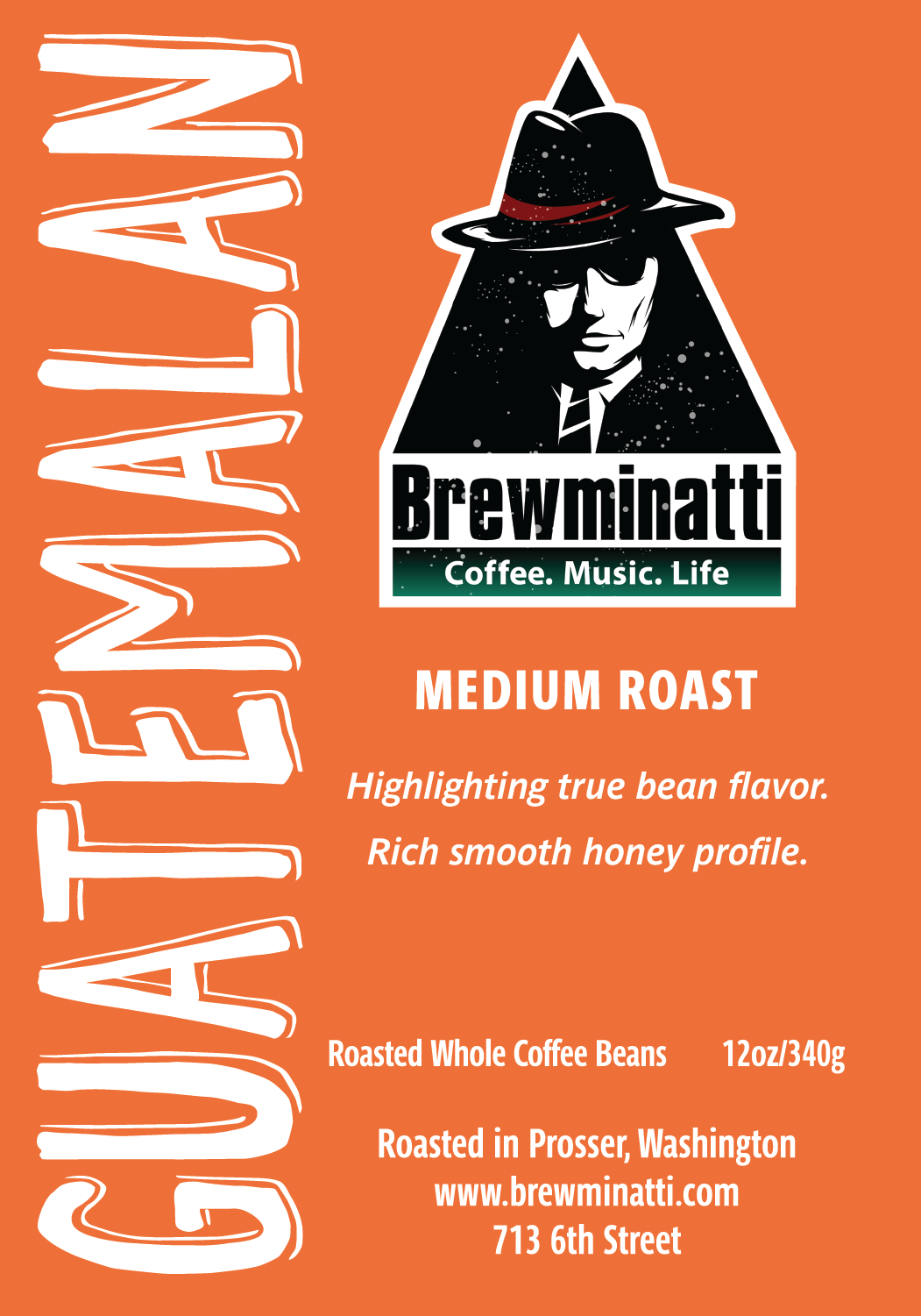
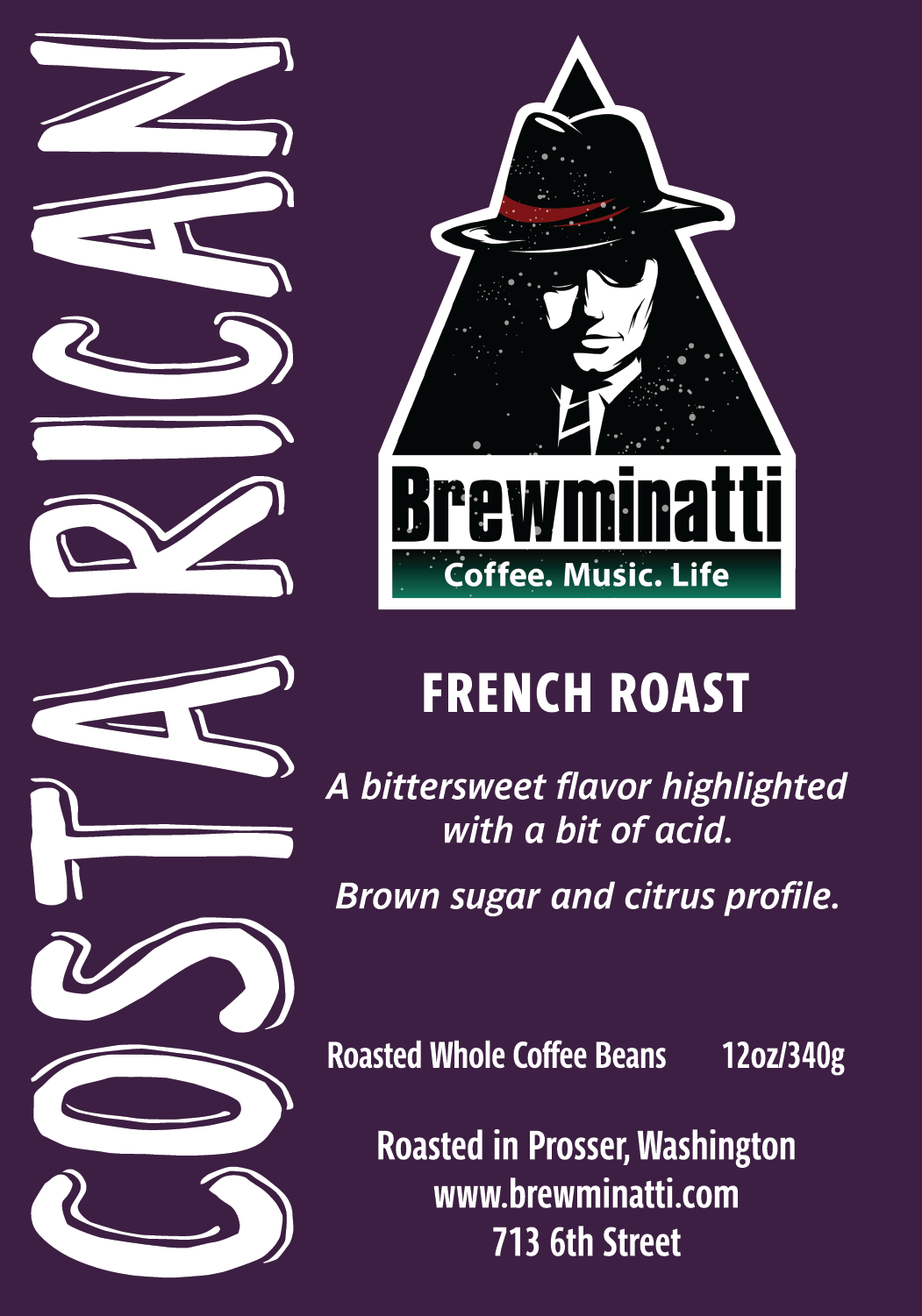
The existing shop logo was used as a secondary point of importance, and details on each label were completed in bold text, allowing them to pop against the background color.
Later additions to the line of beans include a Decaf and an Espresso roast, which were oriented in contrast to clearly set them apart from the main line since they are not a region specific roast.
