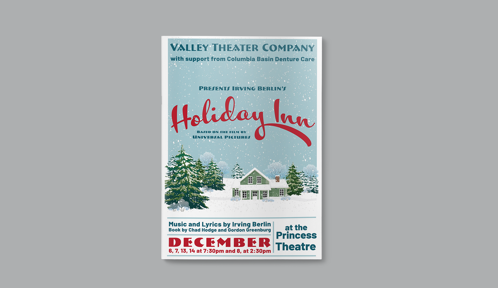
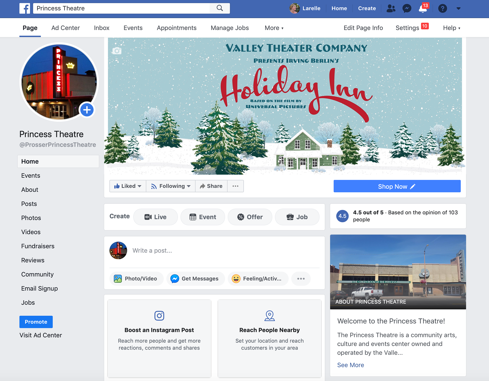
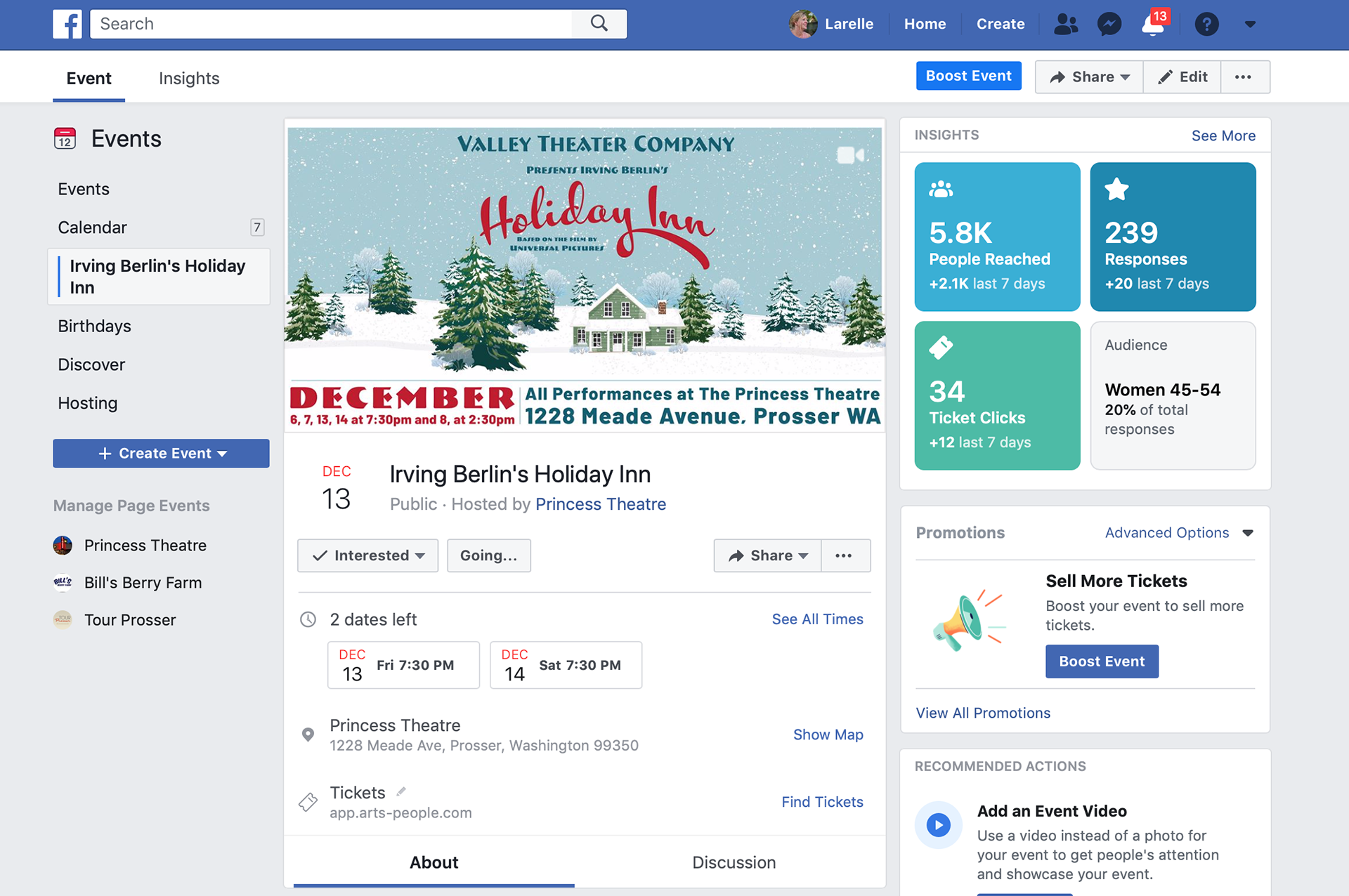
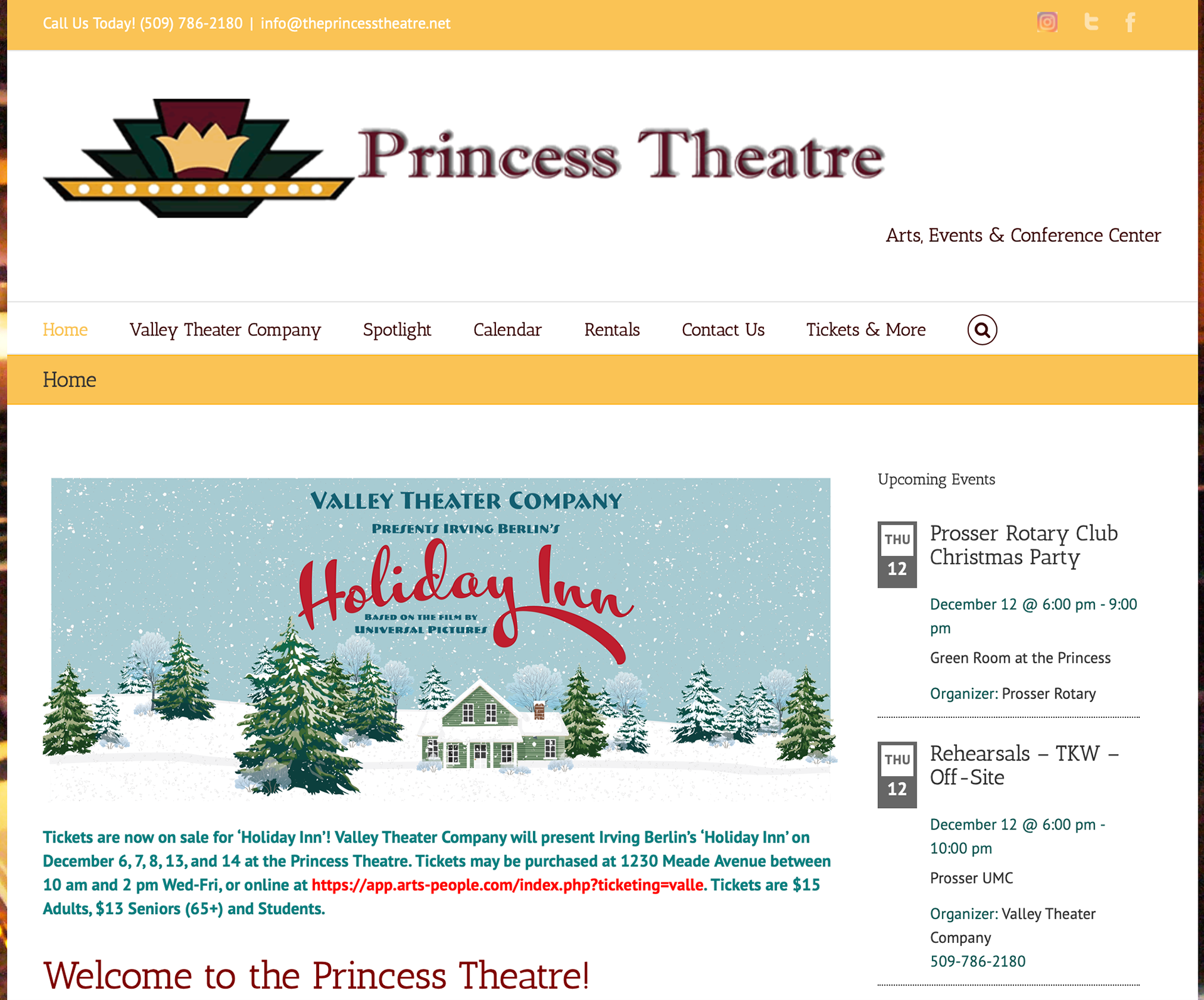
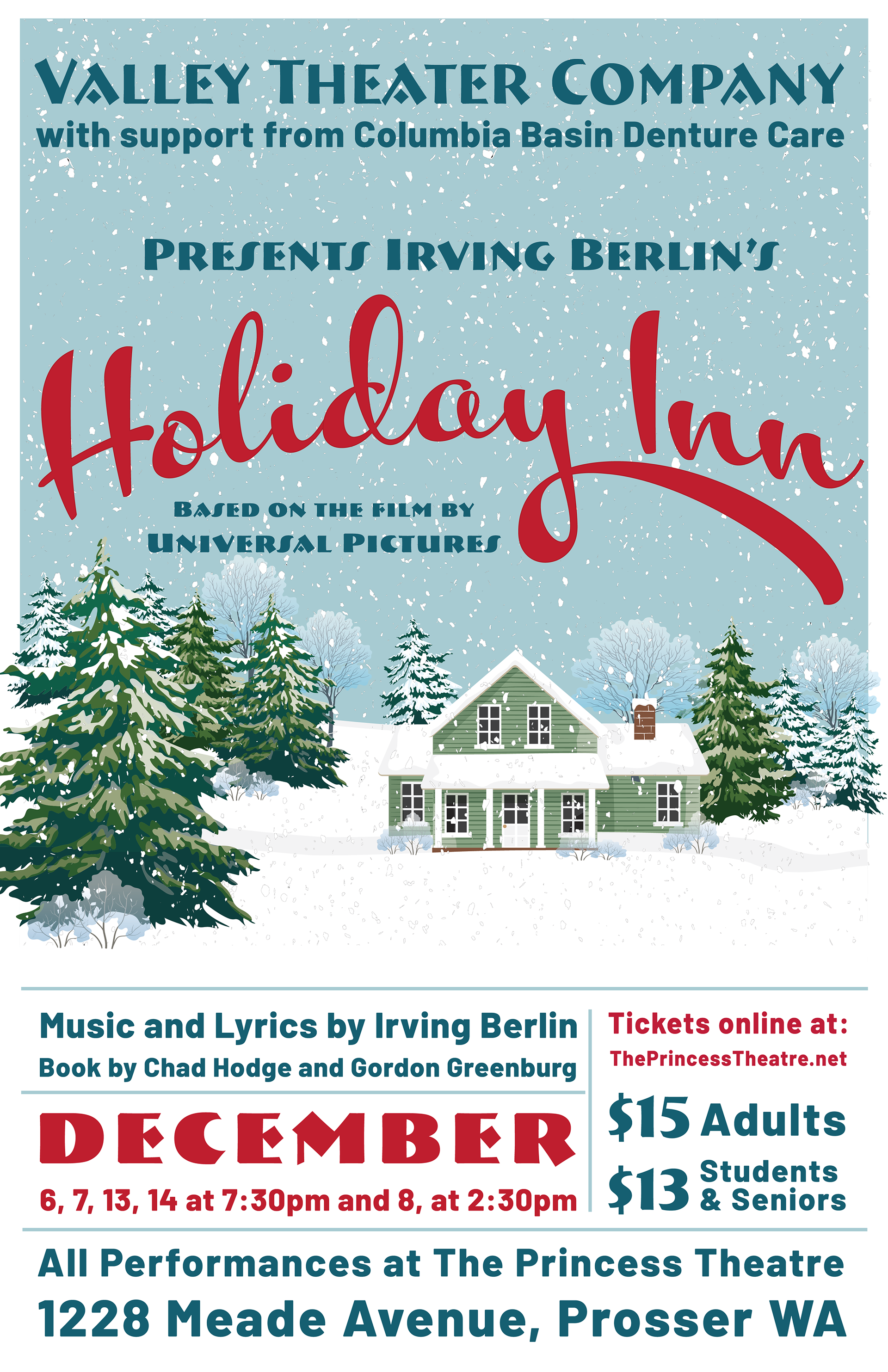
I love being involved in my community theater, and was pleased to create the designs for their production of Holiday Inn in December 2019. The show takes place in 1946 and 1947, so it was important to the Director and Producers to have the design give a nostalgic feel to potential audience members while also very clearly spelling out the necessary and required information.
The main image is a digital illustration, partially designed from by myself. Because of the small non-profit budget we were working with it was deemed more cost effective to purchase the tree illustrations to make effective use of design time.
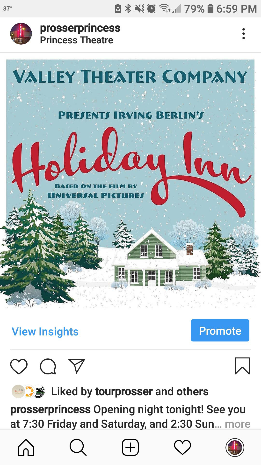
The design also had to work over a large range of media and sizes, from printed posters and programs to web and social media applications in both portrait and landscape orientations. This was accomplished by varying the size of the main image and the amount of text that was included.

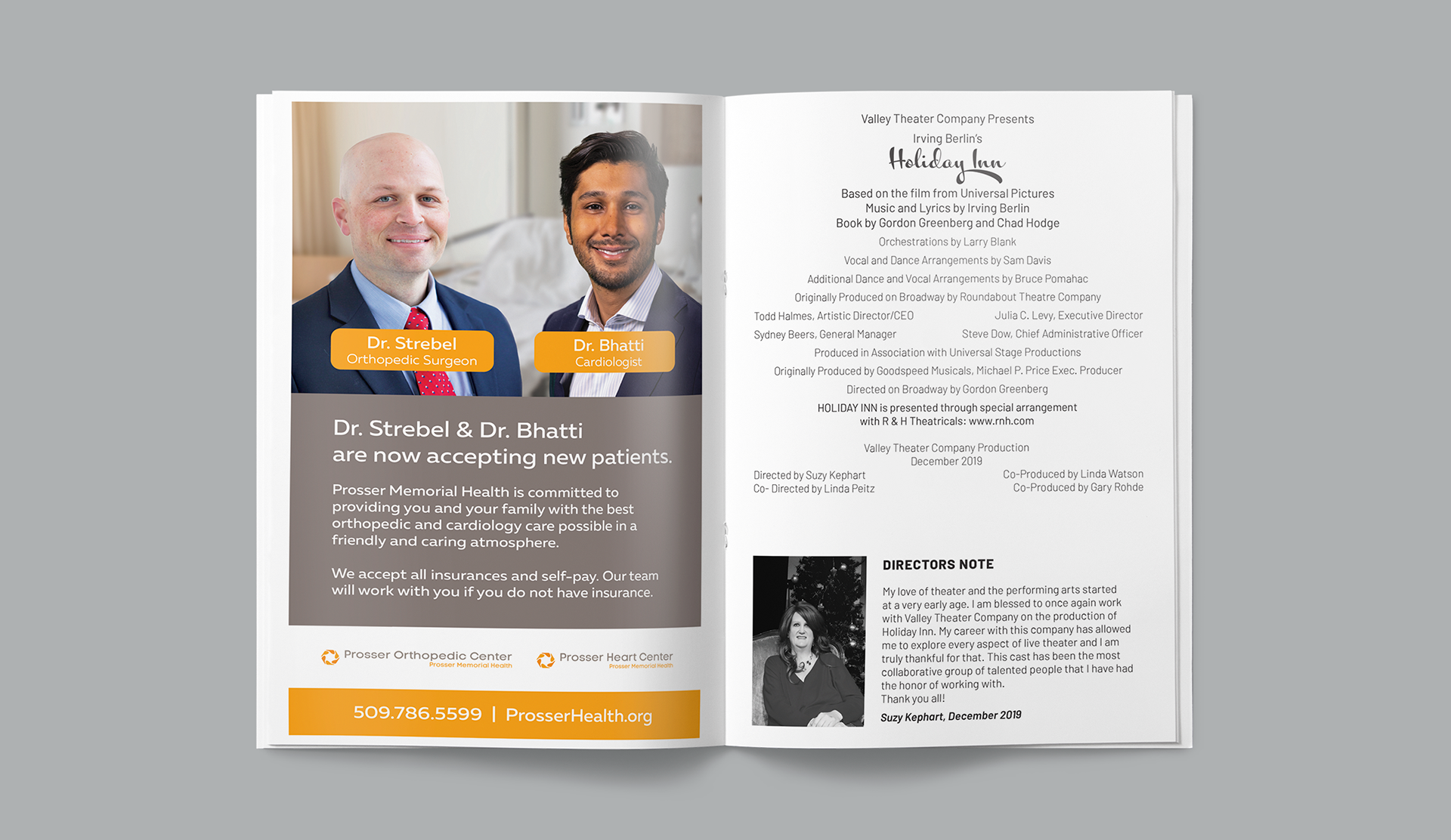
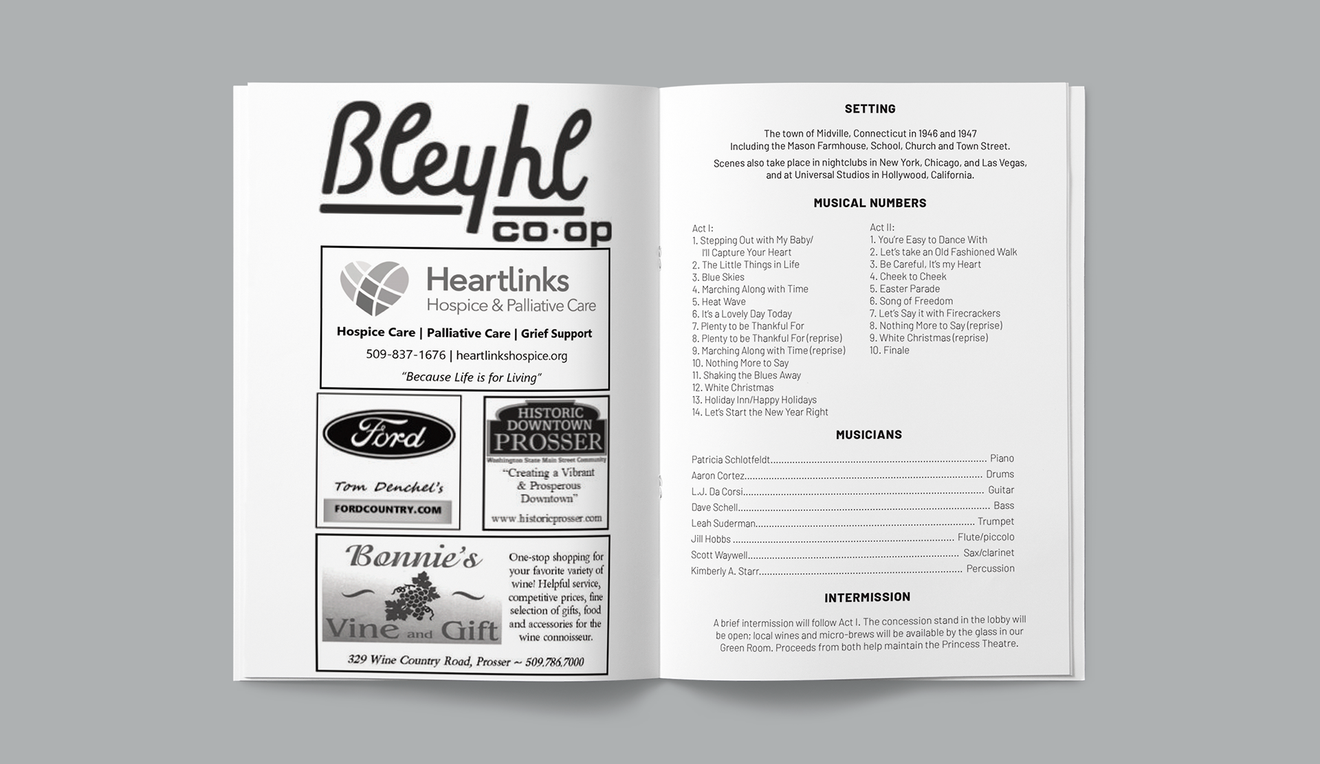
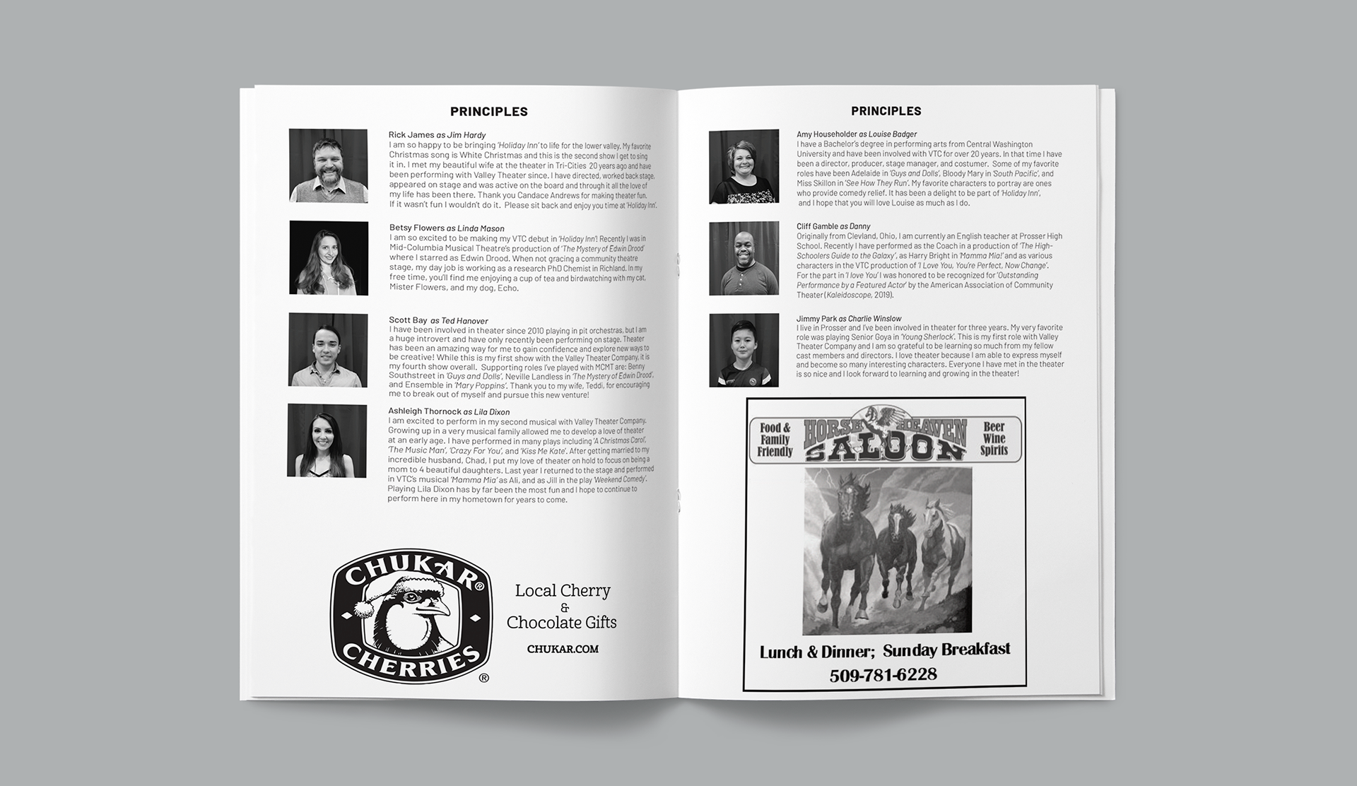
The interior of the program also needed to be designed. The ad sizes were already determined and had to be used as previously contracted, but the Director desired to change the layout to a smaller size than previously used. The result required a bit of finagling but resulted in a more audience friendly size (a folded US Letter) and allowed information to be broken into smaller more readable chunks.
