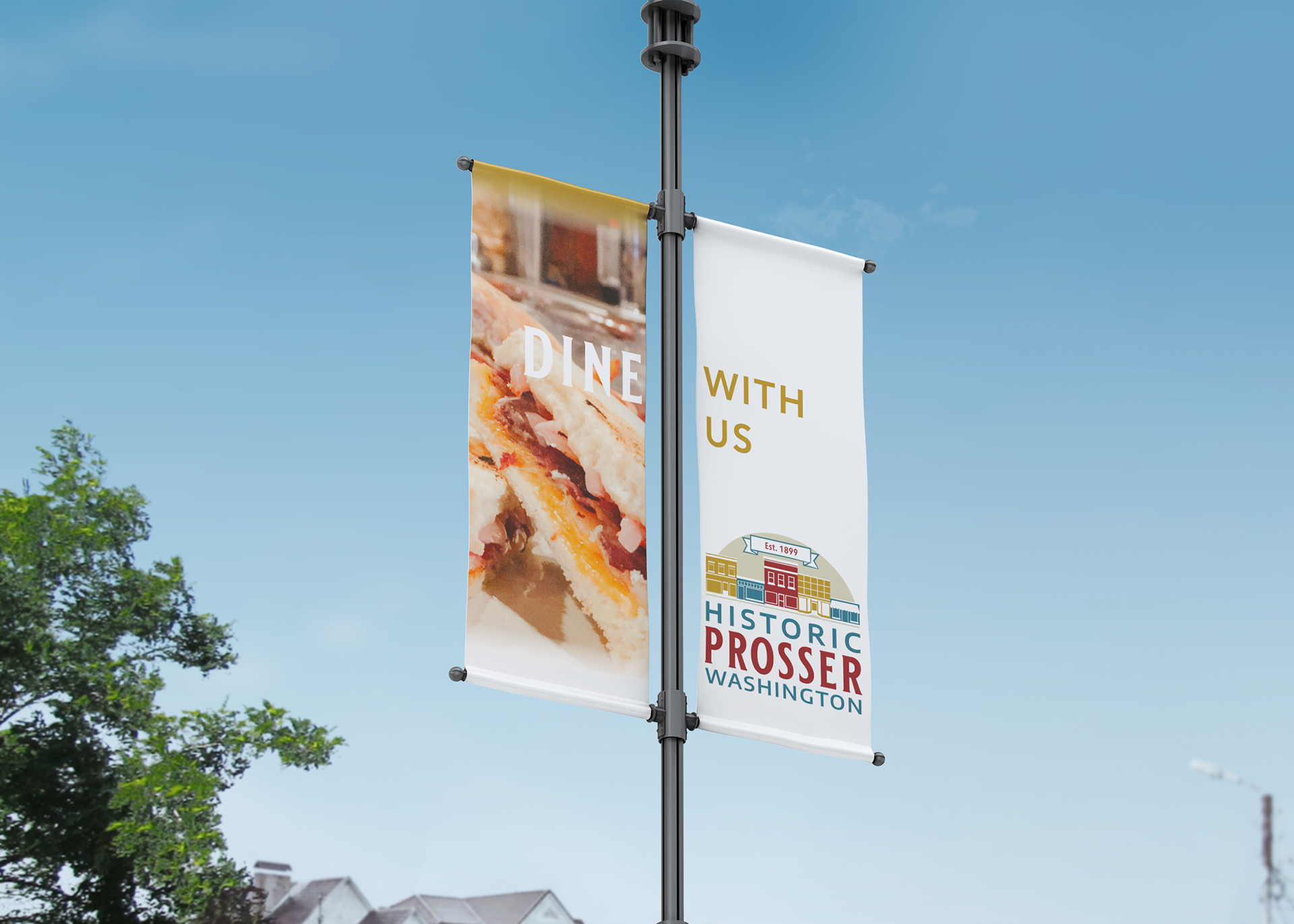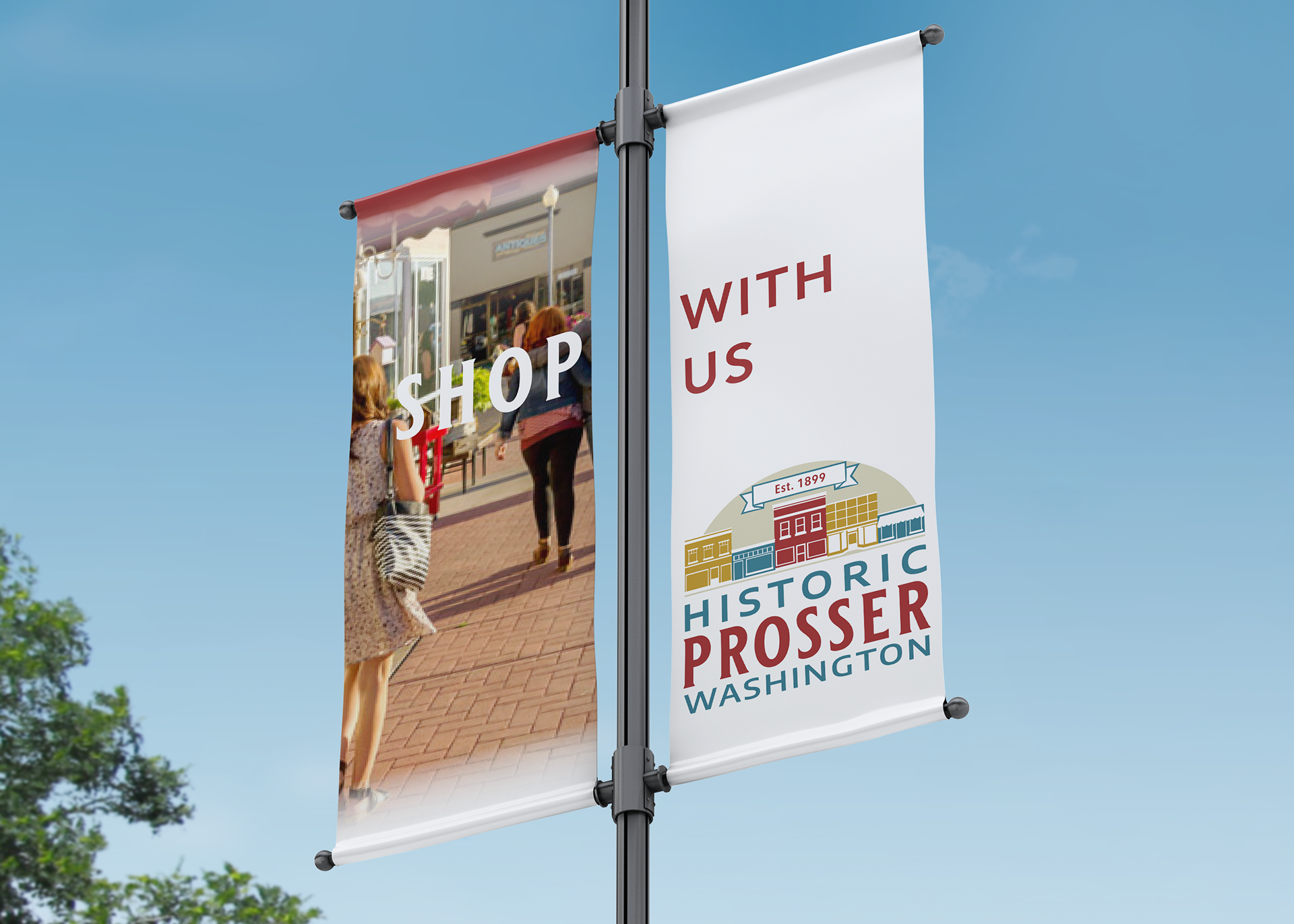
When the non-profit Historic Prosser asked us to help them with a logo update that would refresh their organizations appeal we were excited to work with them on the project. We were able to work with their board to bring their vision for a fresh attractive look that would promote the historic heart of Prosser to life.

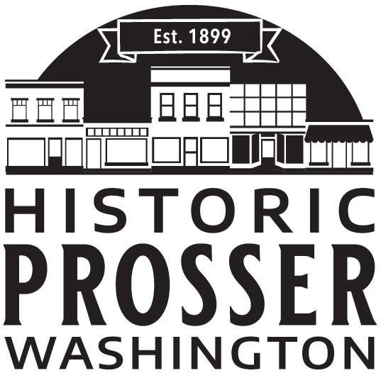
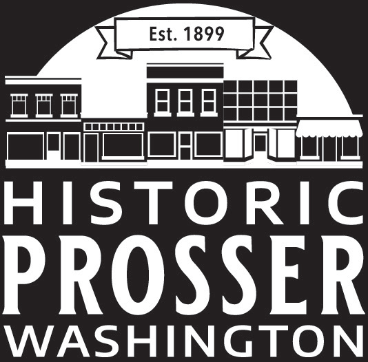
The design features several of the historic downtown buildings rendered in simple form across the top. This allows the words to work in the hierarchy of the design as the main feature with a classic serif to highlight the town name. Paired with a sans serif in a contrasting color the destination pops from the design. It also draws inspiration from traditional ghost signs that are found in many historic town centers, including in Prosser.
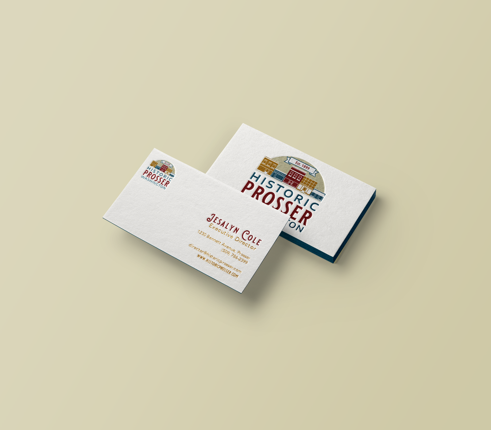
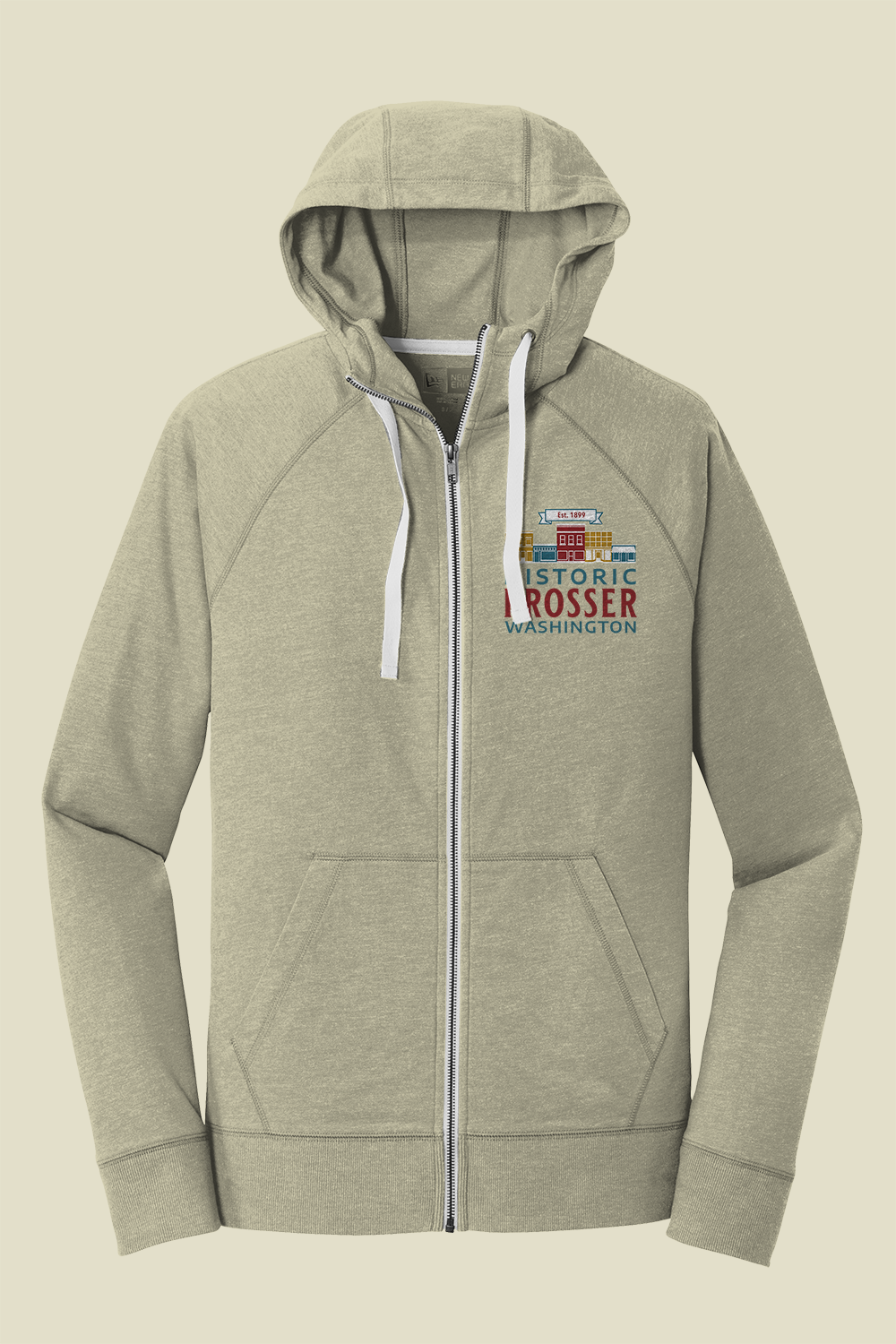
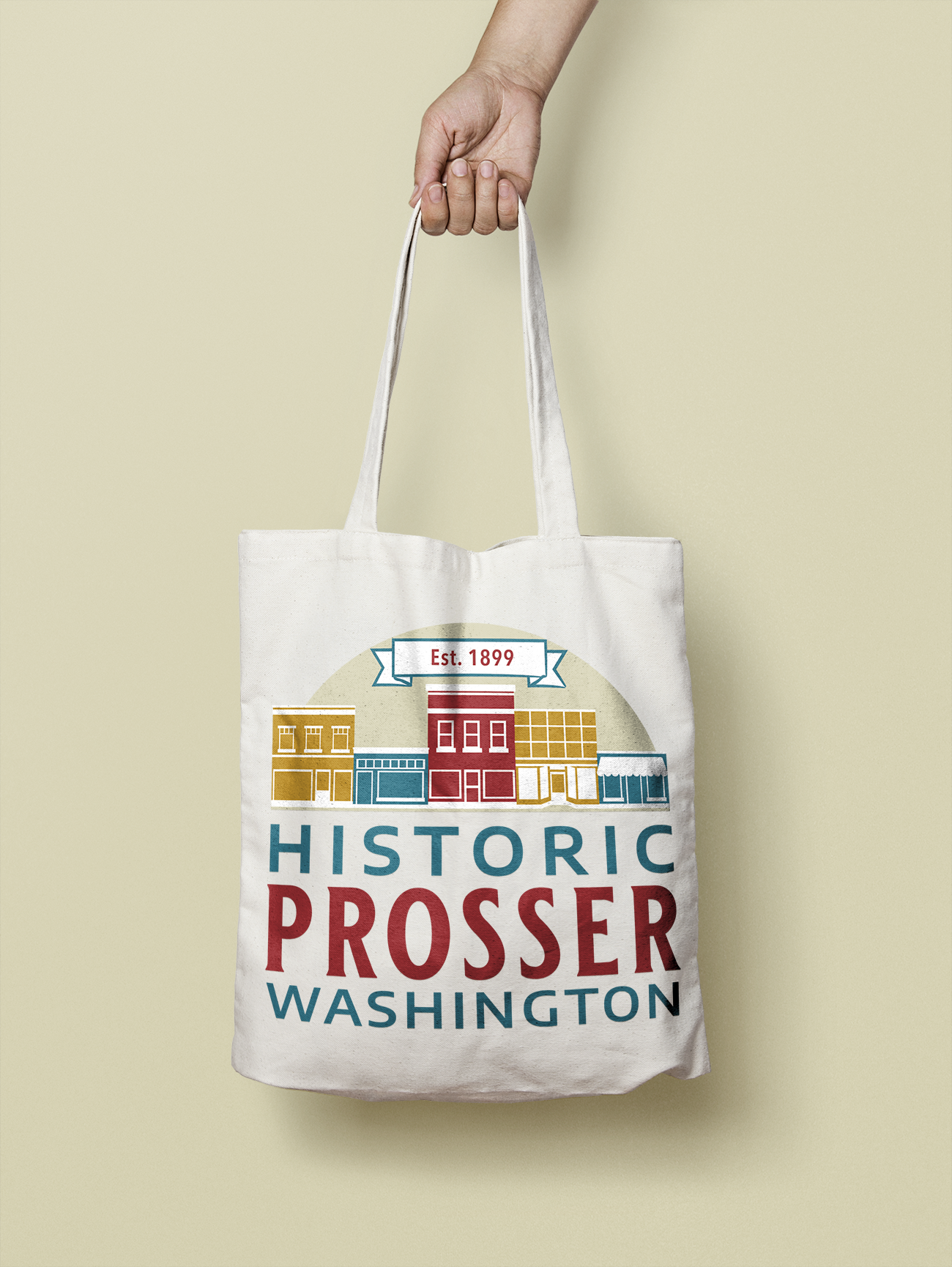
When used across collateral for the organization the designs colors are eye catching and appealing. It works across a variety of applications easily, and the addition of a black and white version give the logo flexibility.