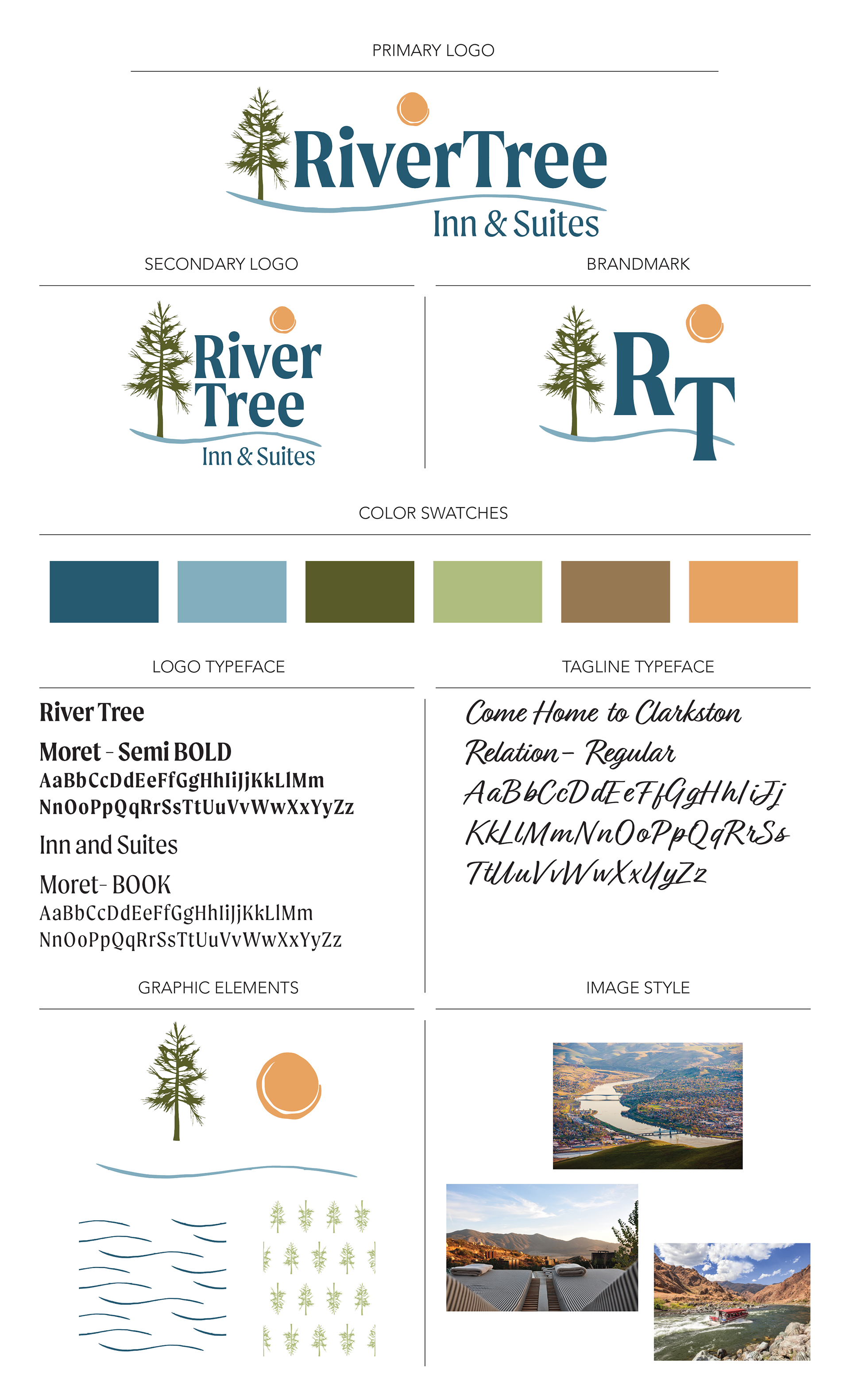
A hotel in a destination location, The River Tree Inn & Suites needed to be rebranded from a national chain into a locally owned single location. It had an existing name and an established clientele, but needed a facelift that started at the sign out front and could be implemented at every touch point of the brand throughout the property.
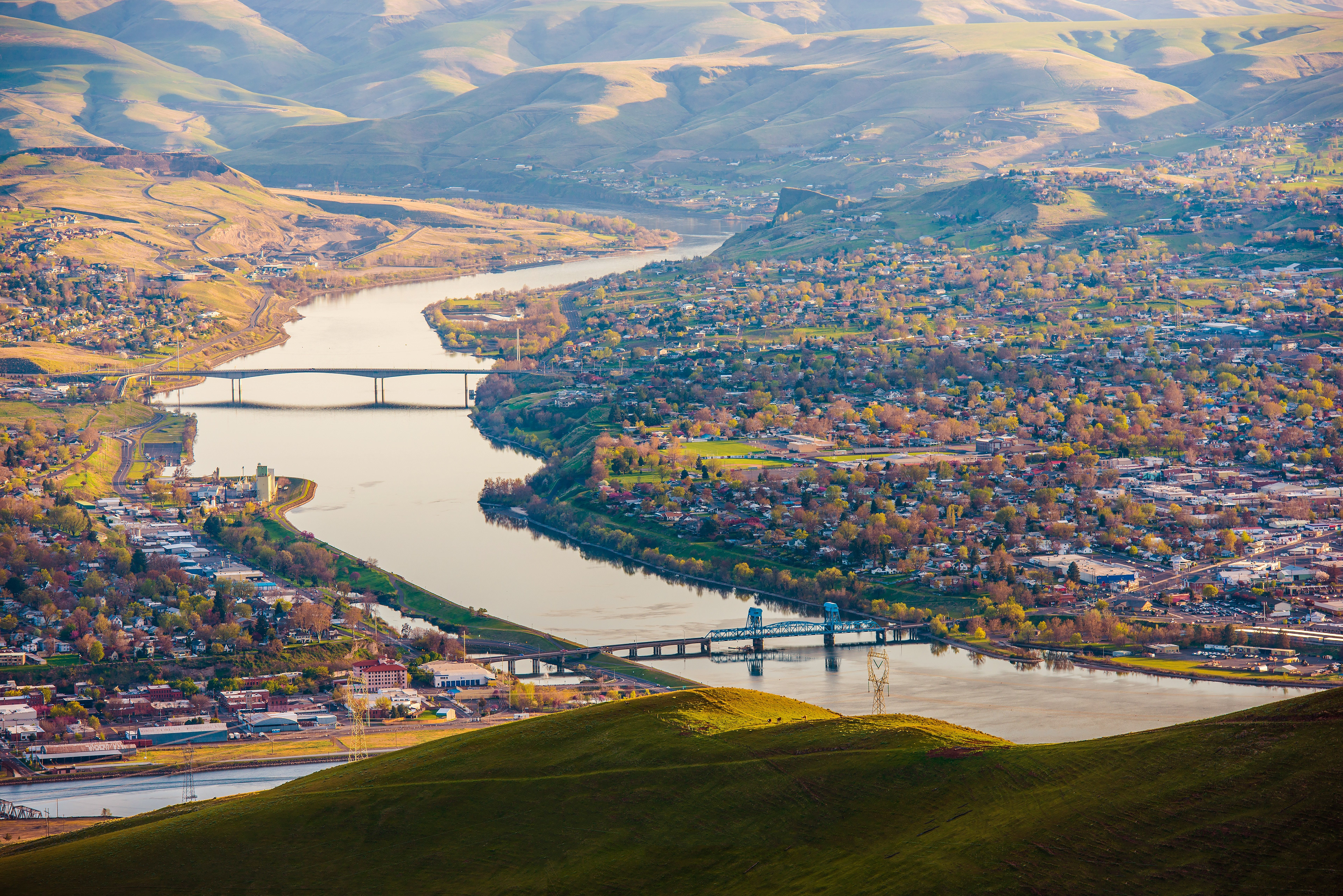
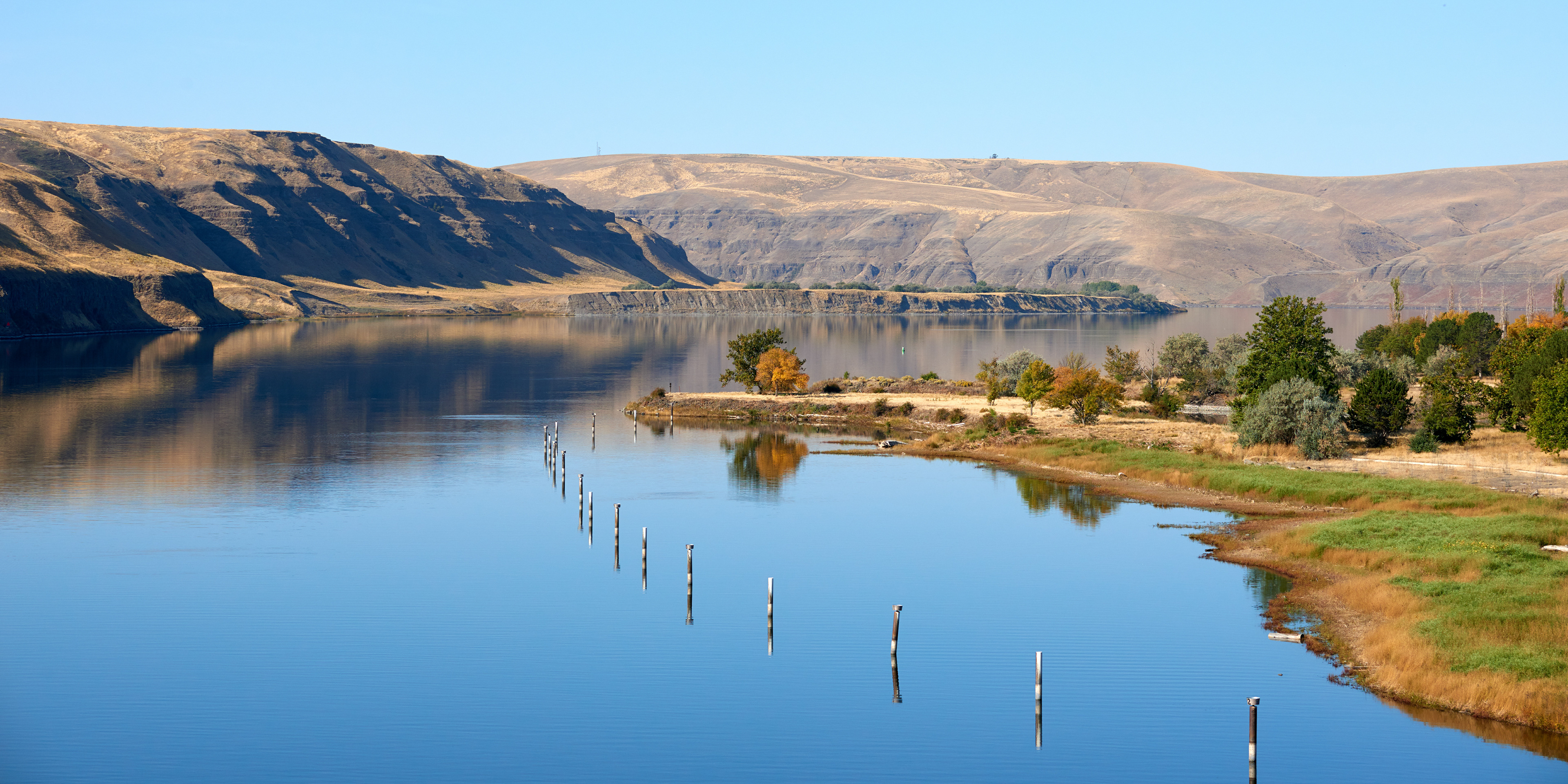
The brand is built around the keywords Warm, Welcoming, Classic and Natural, building off the desire to create a welcoming place to stay and incorporating the natural beauty of the region it is located in and named for.

Initial designs explored options ranging from clean and modern to rustic, but as we narrowed our focus into our key phrases it became clear that we needed a design that appeared established without loosing it's fresh feel.
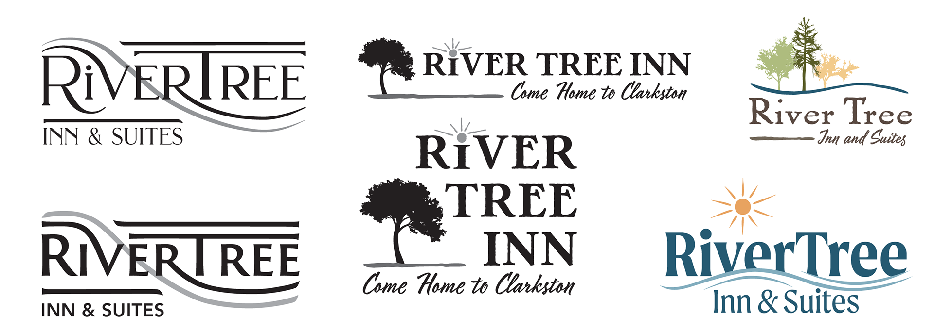
A bold serif type was selected, accompanied by the River and Tree elements, all rendered in colors drawn from the warm sunlight and earthy richness of the region.

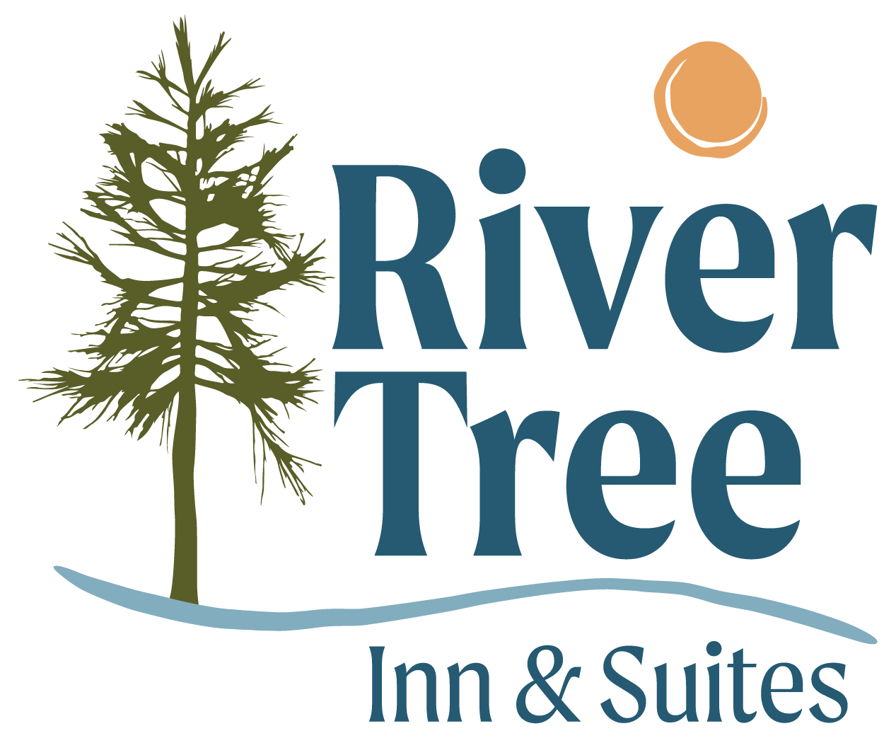

The final suite of 2 logos and a brand mark will be implemented across the property touch points. In addition, a complete brand guide was created to create unity and continuity of representation in everything from paint colors and furnishings to printed materials and signage throughout the property.