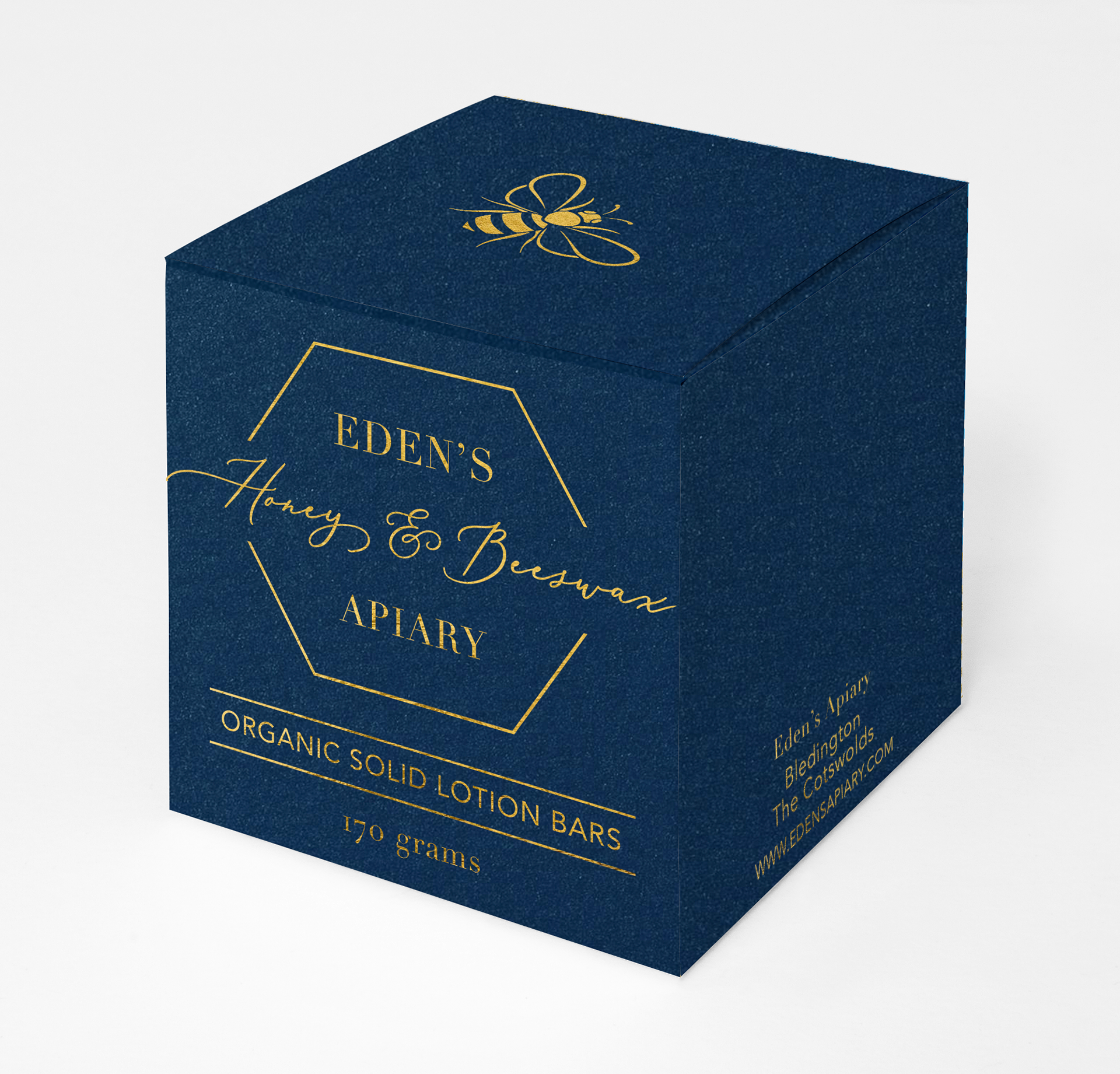
As a small boutique honey company in rural England, Eden’s was looking to update their packaging to better appeal to their target market of buyers who wish to experience luxurious local food products. The design steers clear of traditional honey packaging stereotypes and instead draws inspiration from high end cosmetics packaging.
Personal Design Project
Clean, simple serif and sans-serif type choices are highlighted with a labeling system that uses a hexagonal honeycomb inspired frame and an elegant script typeface to draw attention to each particular products unique features.
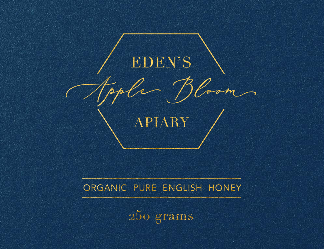

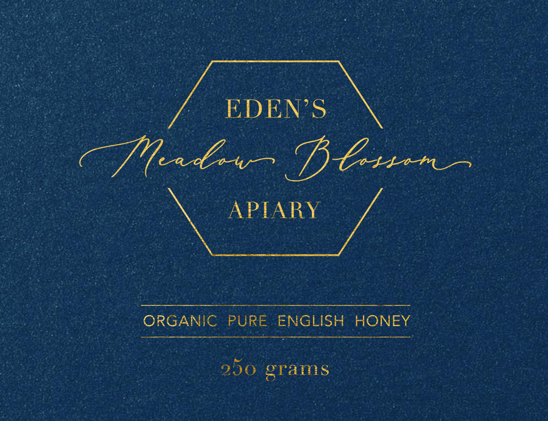
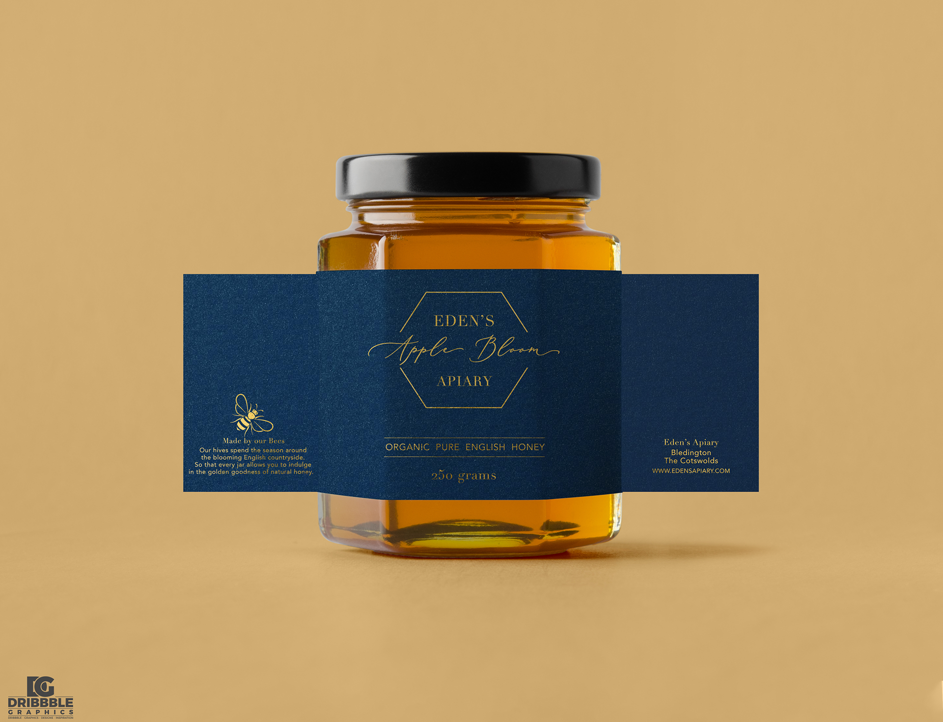

The labeling system of separating information into individual units allows for simple expansion across of range of additional products should the company ever decide to increase their offerings.

