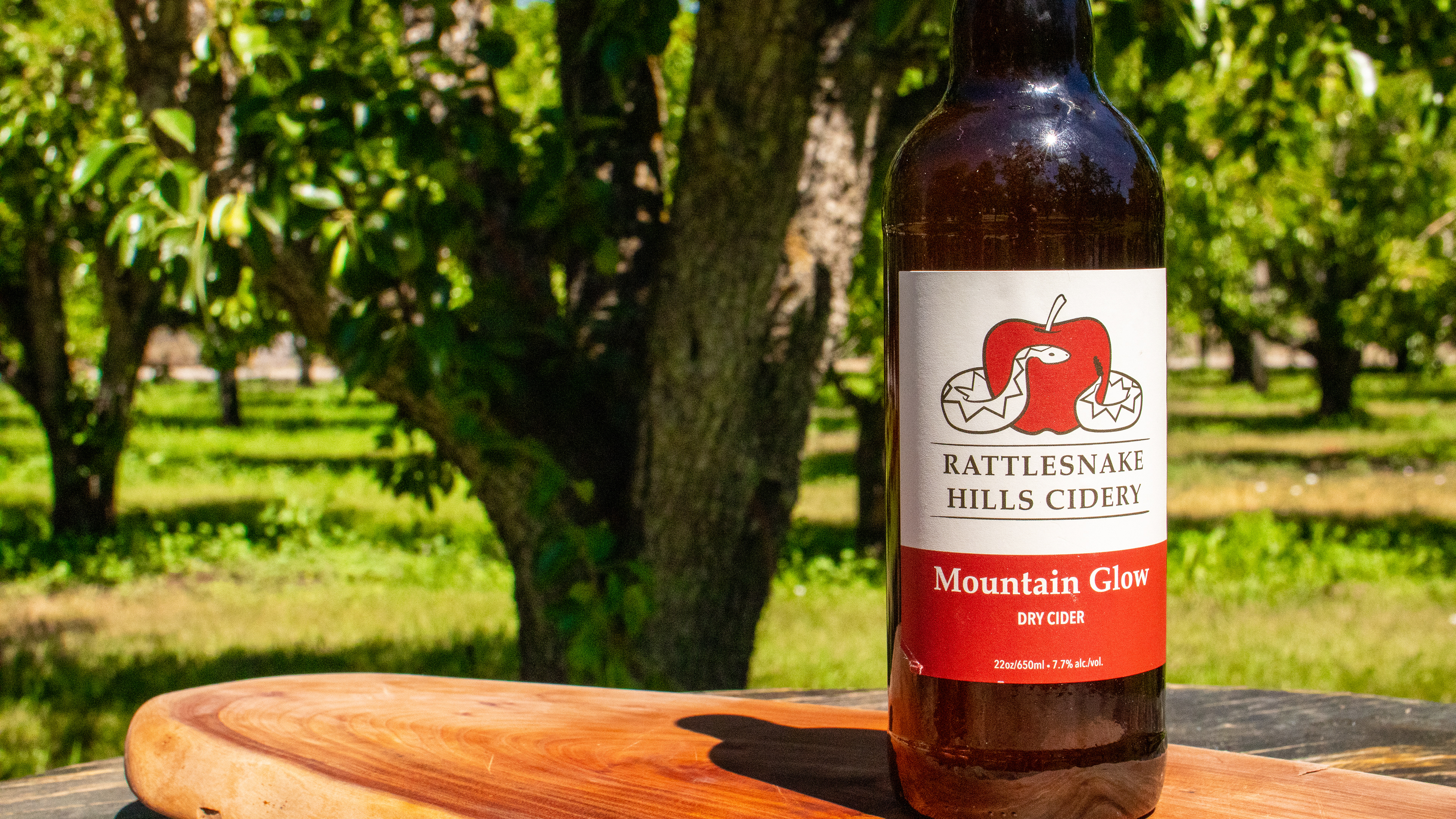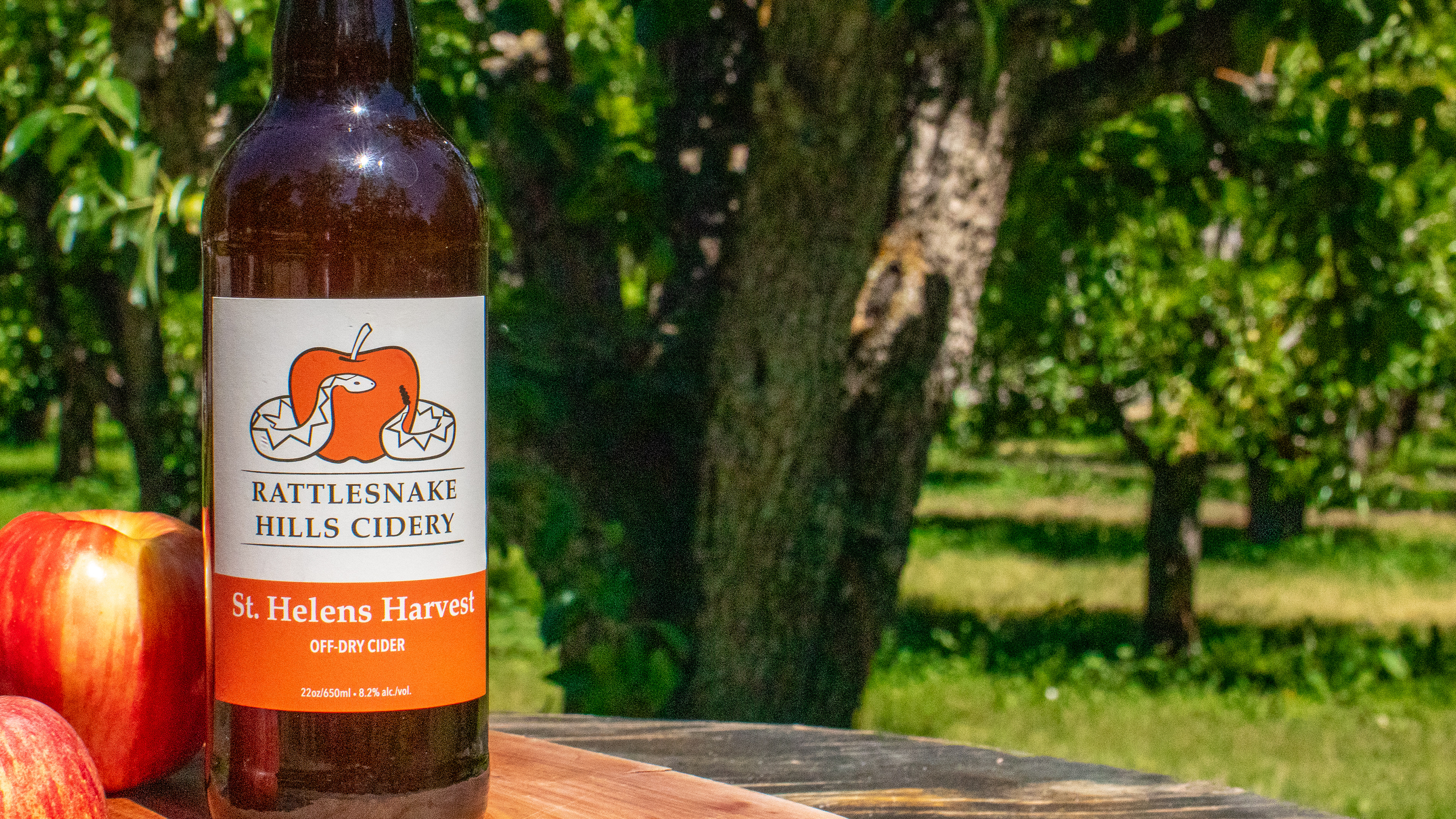
Rattlesnake Hills Cidery approached us about working with them to develop their full brand. This began with a look at their desired audience demographics and proceeded to identifying an artistic style that represented them. A decision was made to put the emphasis on the local Yakima Valley roots of the brand and to present a polished but eye catching design that would attract crossover customers from local wine tastings.
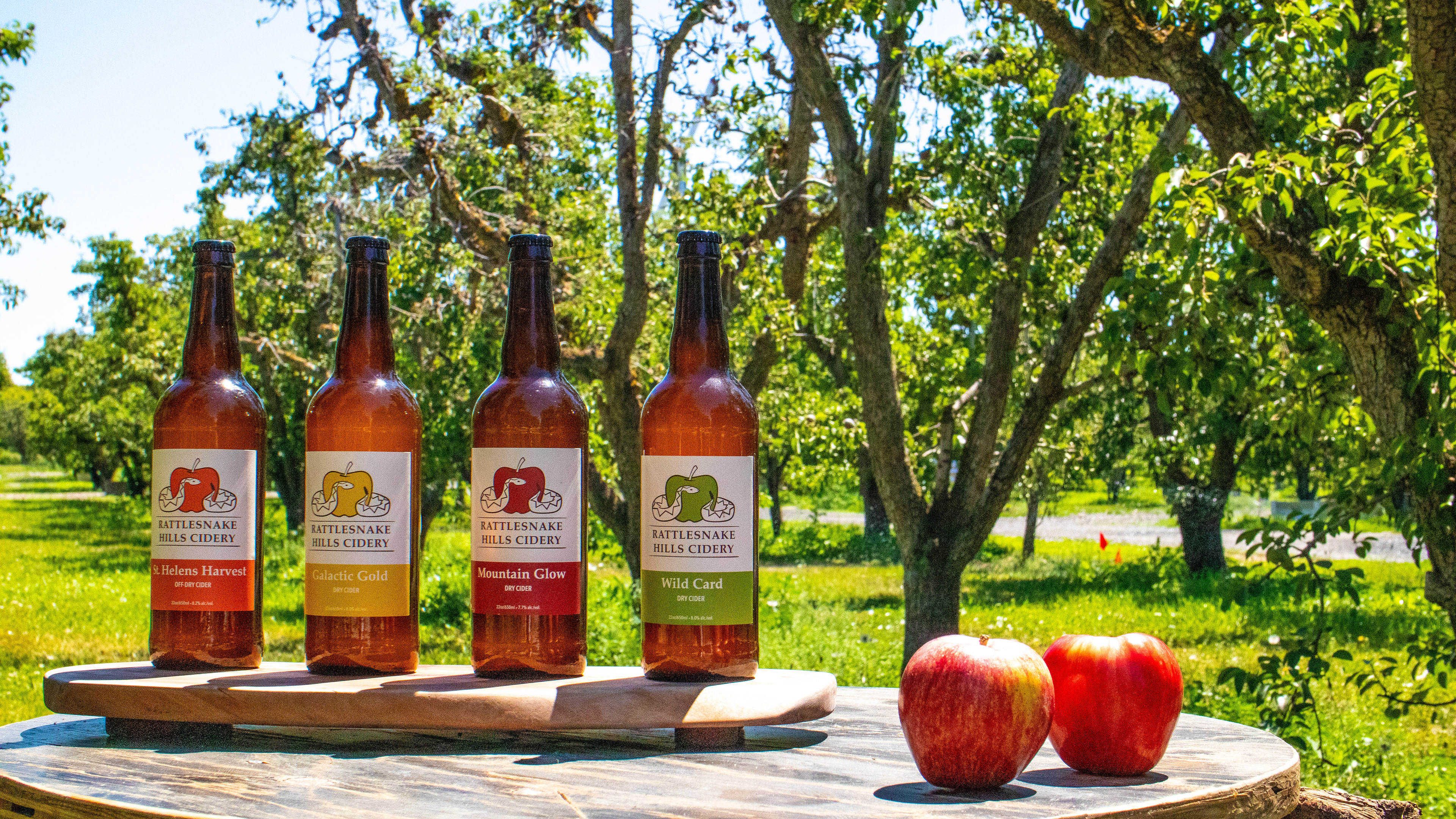
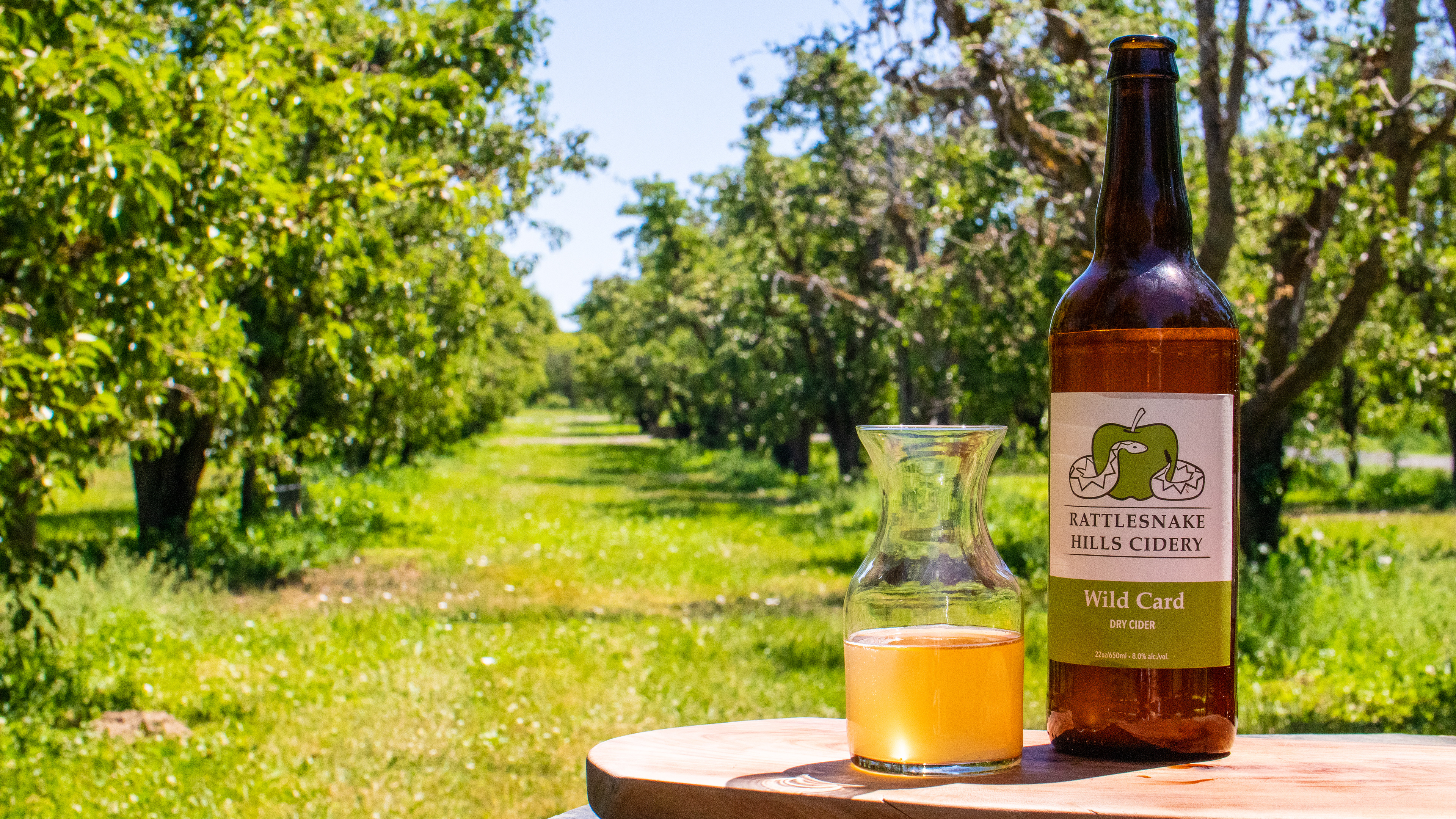
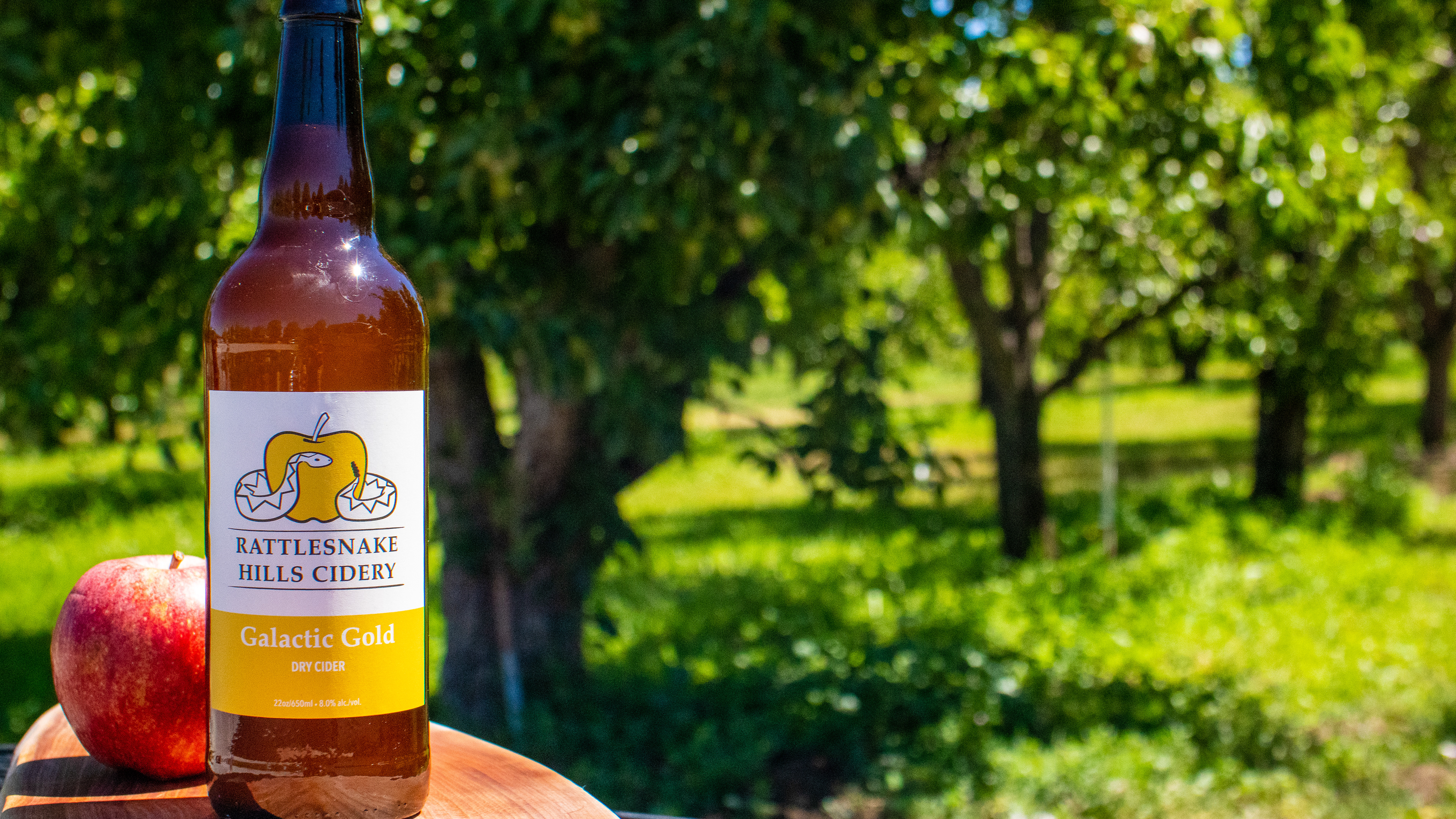
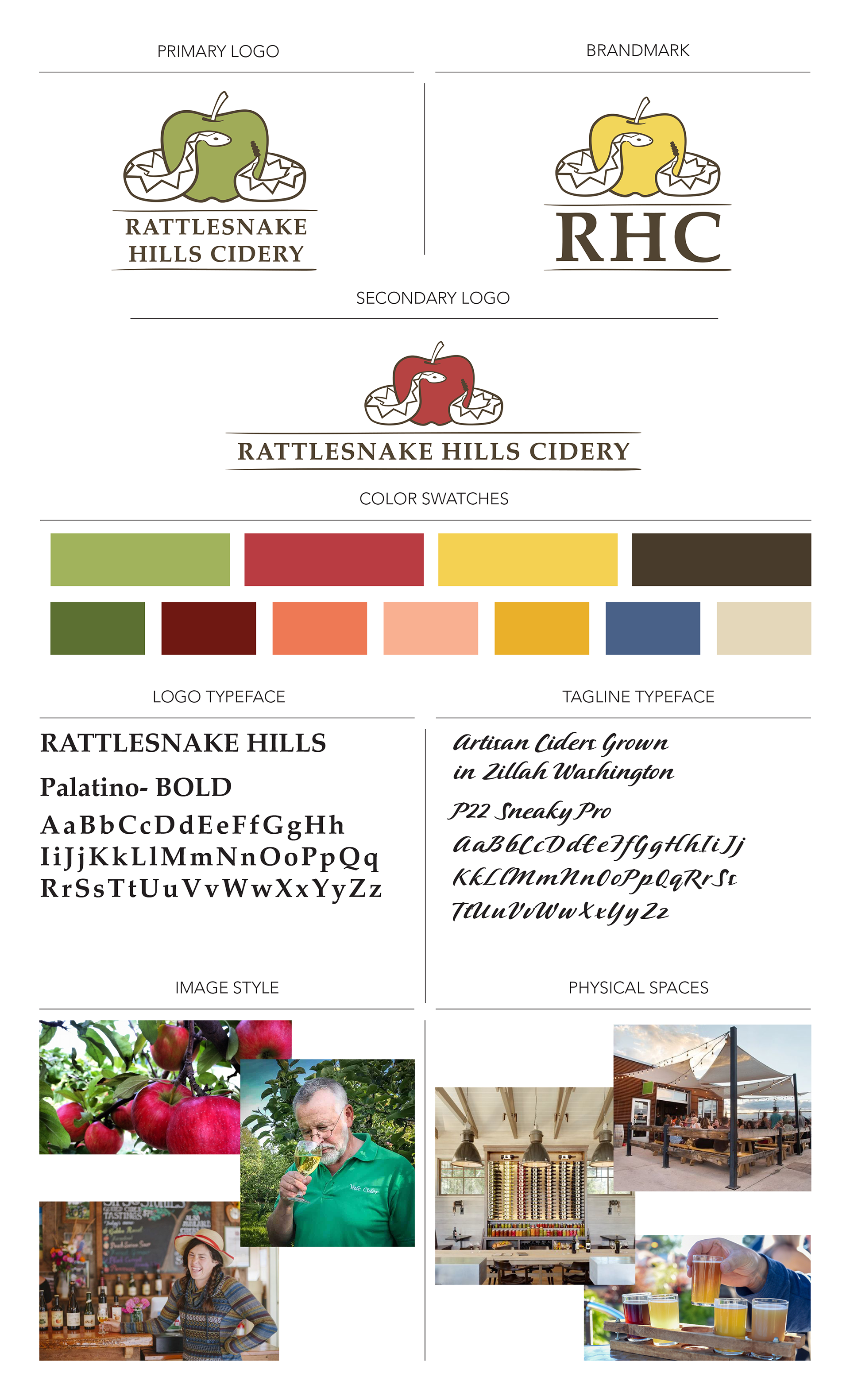
The wife of one of the partners is also very artistic, and she provided initial drawings to get the logo process started. These drawings were developed into several graphic versions which we refined into a final package of 4 logo versions in a full range of colors that represent their different cider flavors.
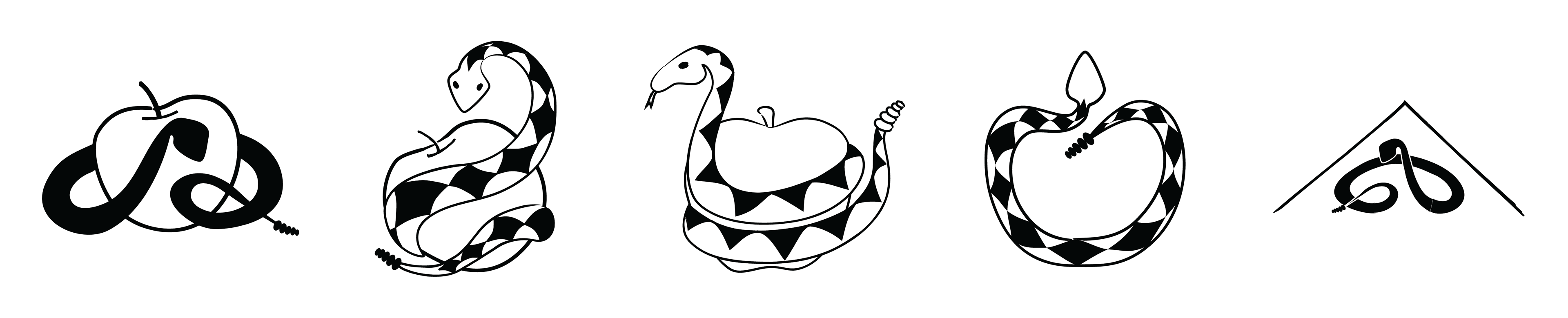
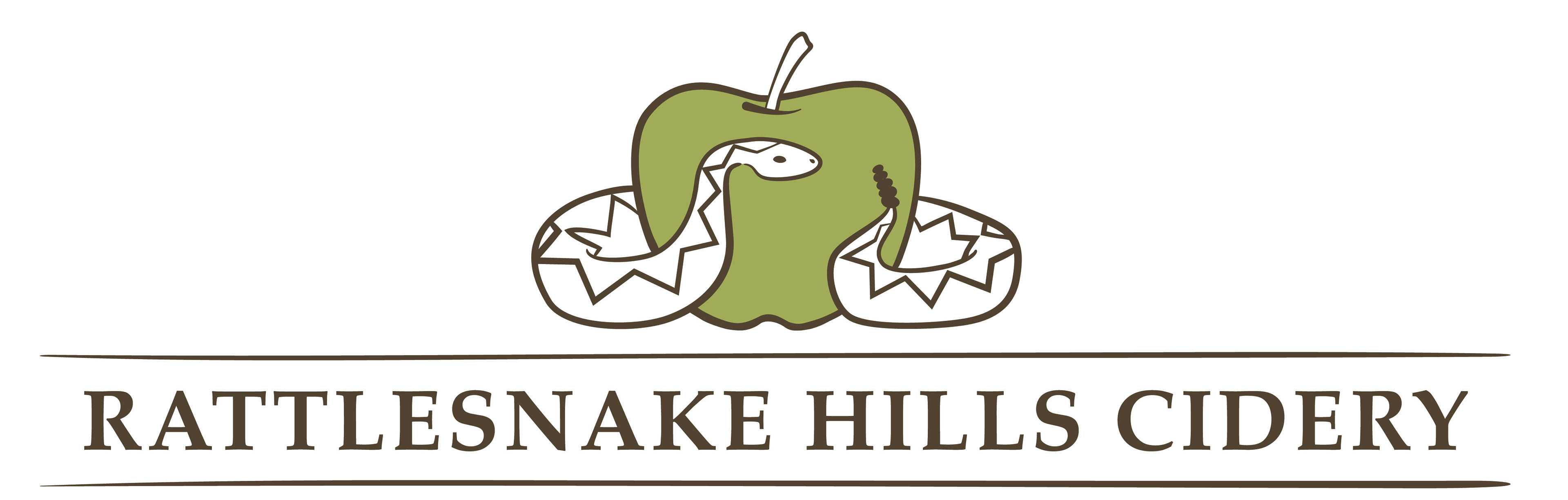
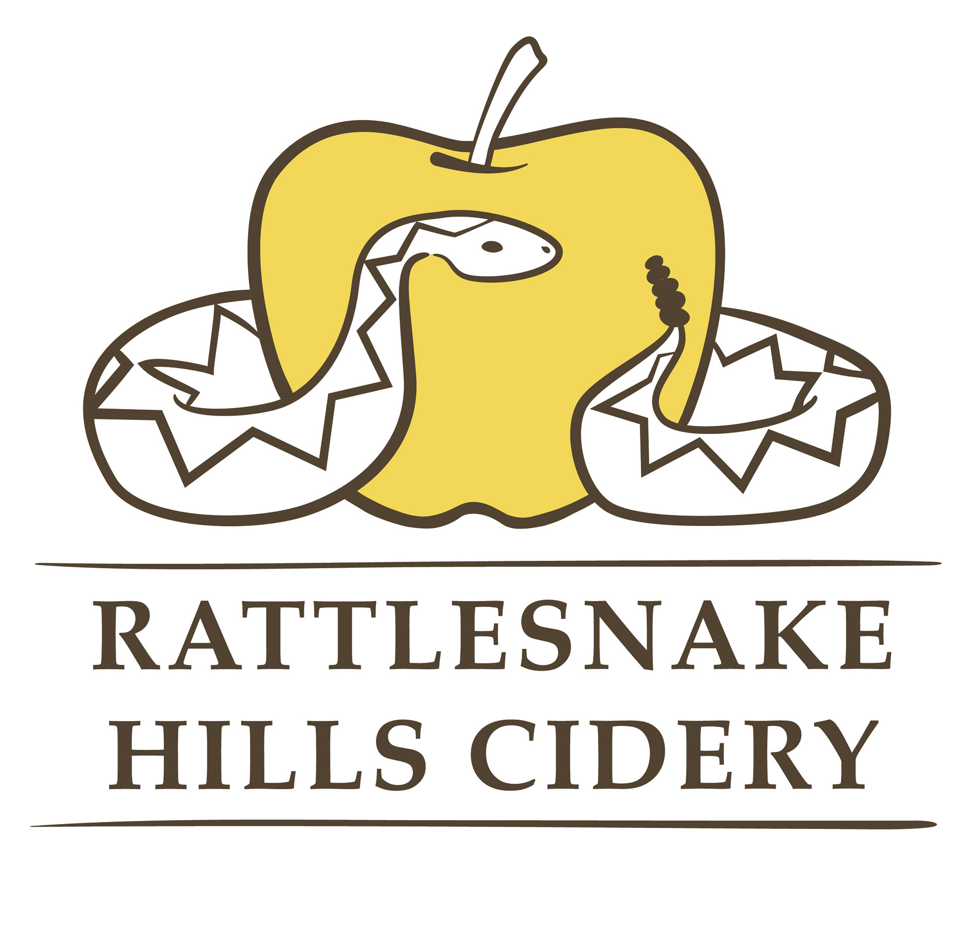
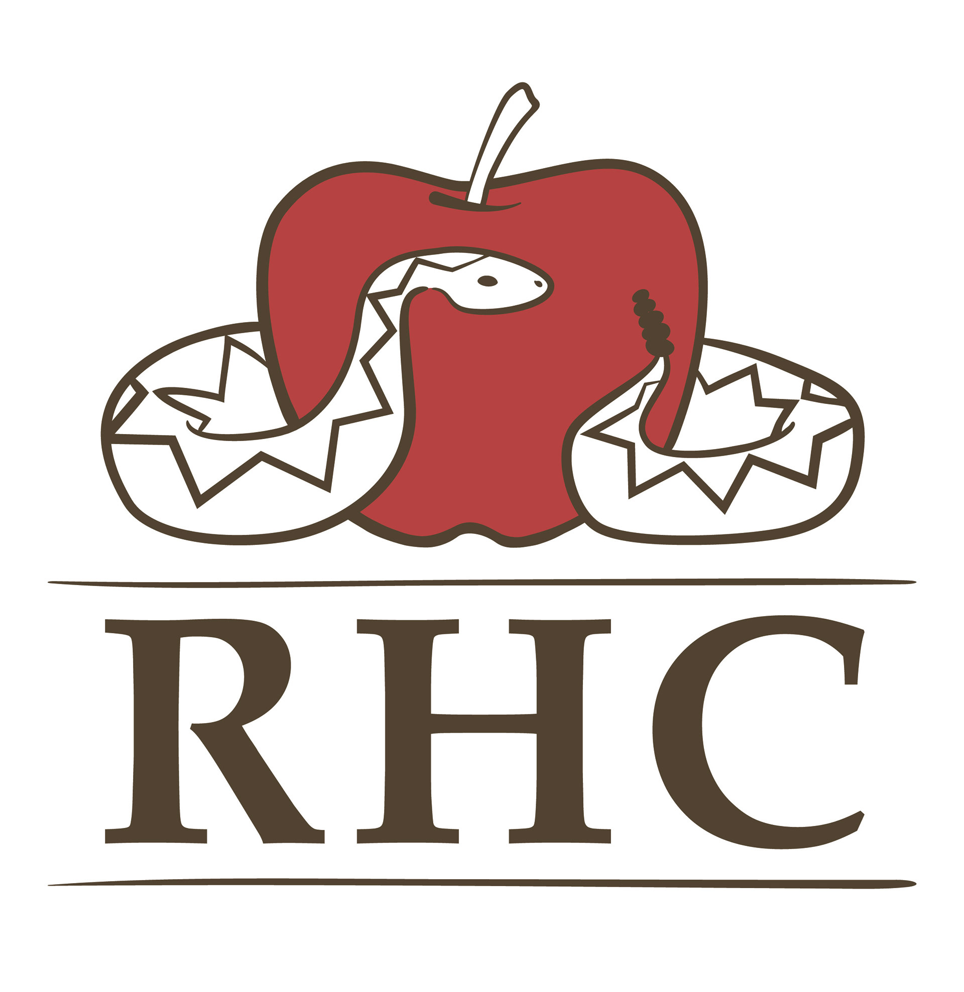
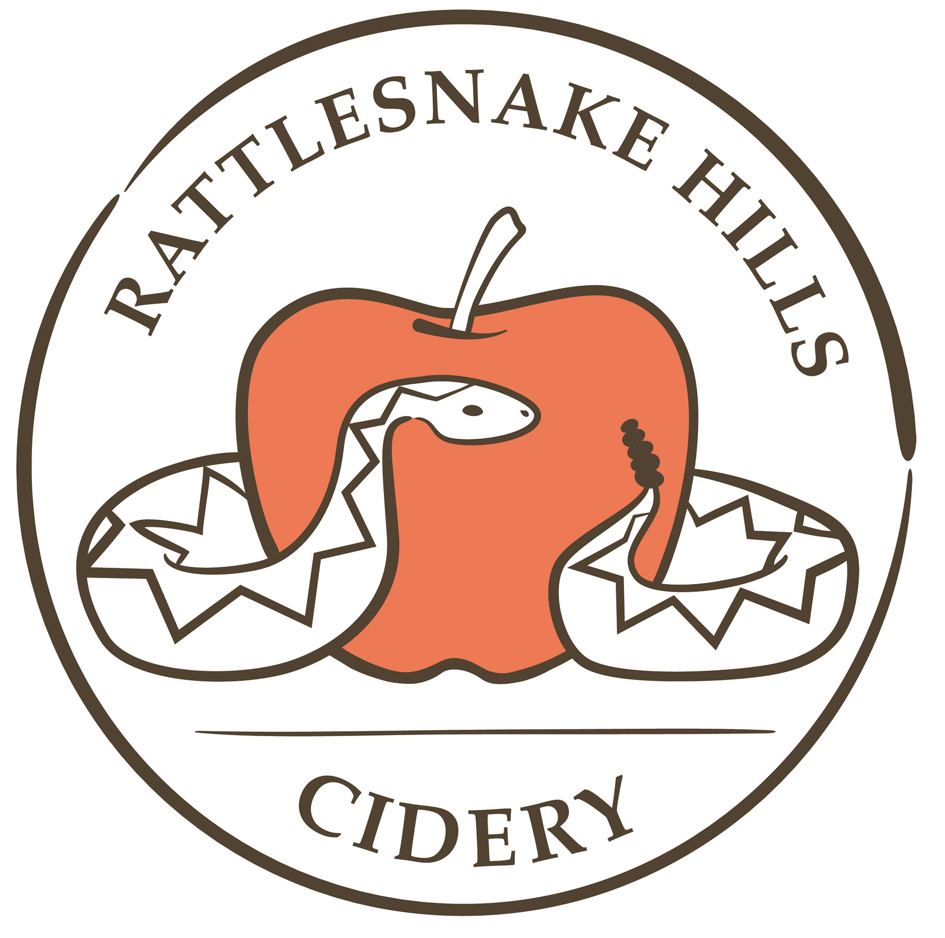
The brand was then fully developed to include guidelines on every aspect from colors and image styles to typefaces and physical spaces for the cidery.
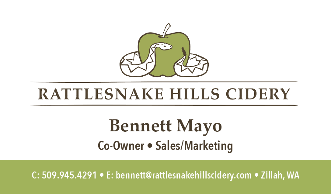
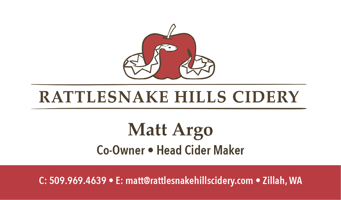
Once the Brand was complete, collateral materials were created, beginning with labels for their current cider flavors, and business cards for the partners. Further work on brand representation will be done as they complete their website and create additional collateral materials. All of which can be guided by their comprehensive brand book to maintain cohesive presentation.
That makes all of us say, "Cheers!"