This project was originally a student brief that I dusted off and revisited a few months after graduation when I wanted to do more editorial layout and design. The concept for the company is a mindfulness studio that focuses on the known scientific benefits and methods of mindfulness, rather than the more common spiritual and meditative avenues that some people see as being a little too 'woo woo' to appeal to their rational nature.
Personal Design Project
The first step in the project was to create the company logo. Since Pause is theoretically located in New York City, the company wished to appeal to a demographic of stressed and overworked millennial office employees. To reach this demographic and to clearly communicate the lack of 'woo' in Pause's practice, a clean and simple design of sans serif typefaces was used. This also allowed for us to play with the shapes of the letters to include the commonly used pause symbol.
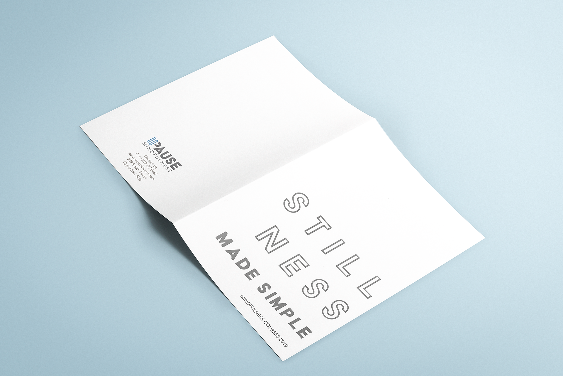
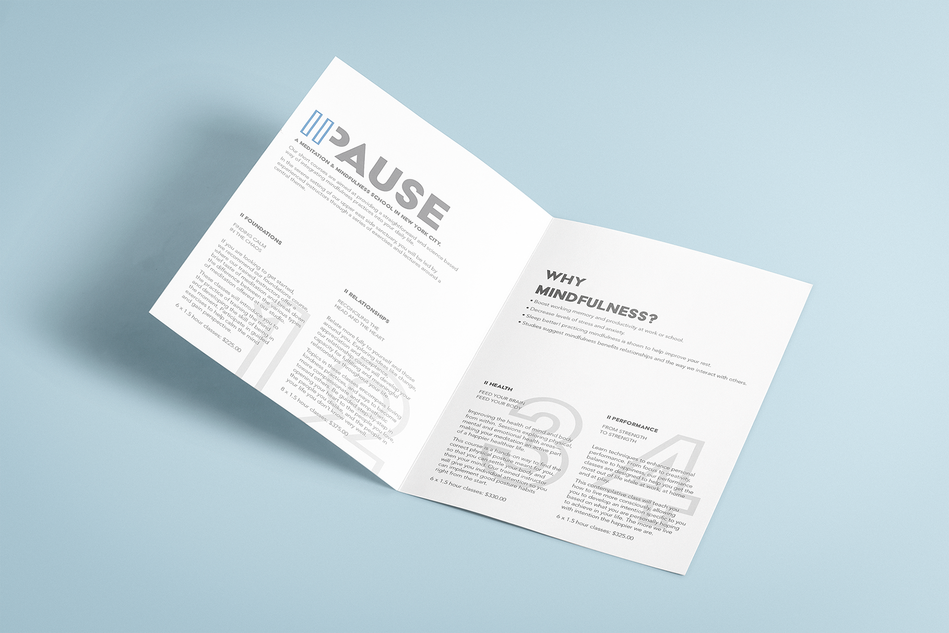
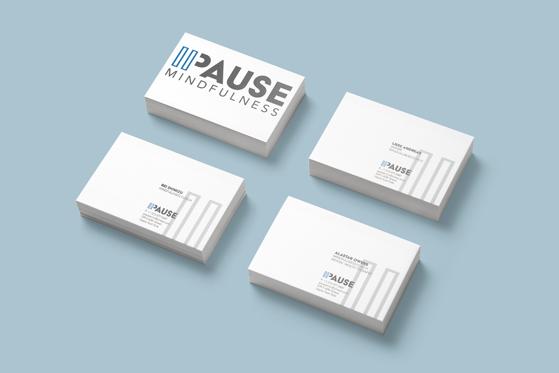
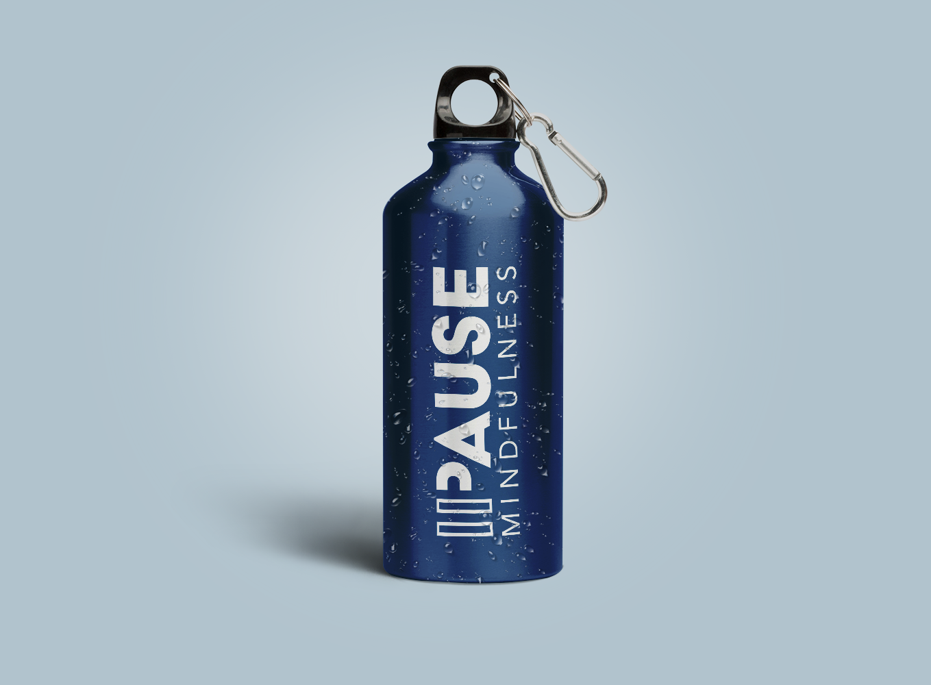
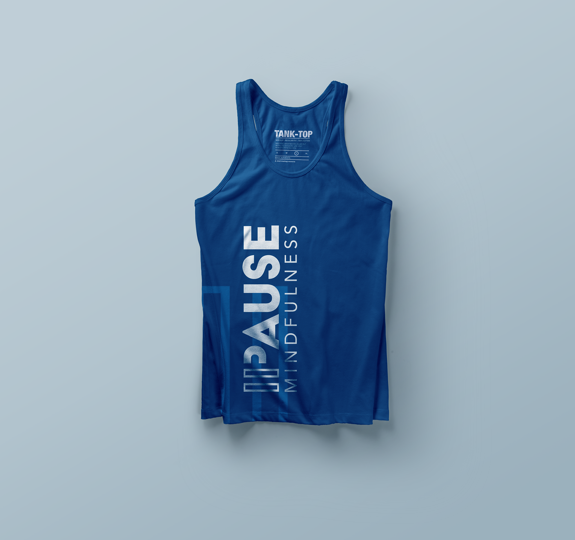
We then worked on the overall look and feel of the brand, expanding the use of the logo and designing collateral materials such as their class brochure and business cards, and practical pieces such as shirts and water bottles where we also explored the use of the negative logo.
The brand balances lots of beautiful negative space with enlarged numbers and symbols. It also balances the use of bold solid sans serif with the same type used in an open version, and a lighter weight sans serif. The blue and grey are calm and peaceful in keeping with the company goal of introducing serenity to your life.
The final step of brand realization for now is the addition of a website, the design of which is in progress. It will also feature the use of white space, grey and blue tones, and black and white photography to share the message of mindfulness with all.
